CSS Grid Layout:
CSS Grid Layout is a powerful layout system in CSS that allows for the creation of complex, responsive web designs. It uses a grid-based approach, making it easier to design web pages without the need for floats and positioning. CSS Grid Layout is highly flexible, providing more control over the alignment, order, and placement of items within a container.
1.Grid Elements:
Grid elements refer to the various parts that make up a grid-based layout. These include both the container element that holds the grid structure and the items that are placed within that grid.
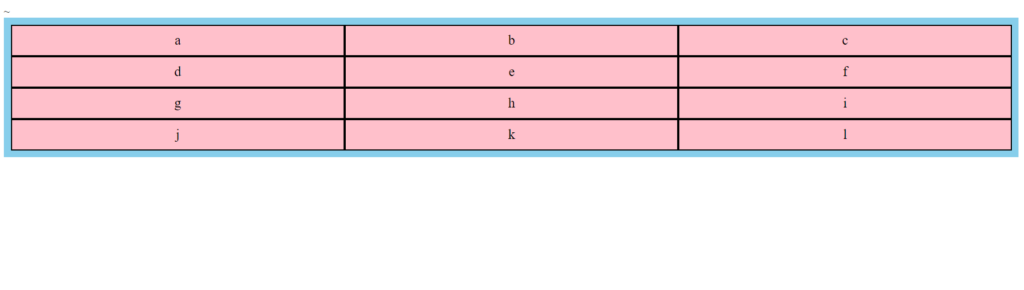
Example:
<style>
        .grid-container {
            display: grid;
            grid-template-columns: auto auto auto;
            background-color: skyblue;
            padding: 10px;
        }

        .grid-item {
            background-color: pink;
            border: 2px solid black;
            padding: 10px;
            font-size: 20px;
            text-align: center;
        }
</style><body>
<div class="grid-container">
<div class="grid-item">a</div>
<div class="grid-item">b</div>
<div class="grid-item">c</div>
<div class="grid-item">d</div>
<div class="grid-item">e</div>
<div class="grid-item">f</div>
<div class="grid-item">g</div>
<div class="grid-item">h</div>
<div class="grid-item">i</div>
<div class="grid-item">j</div>
<div class="grid-item">k</div>
<div class="grid-item">l</div>
</div>
</body>Output:
2.Display Property:
1.grid: The element is displayed as a block-level grid container. This enables the use of the CSS Grid layout model.
.grid-container {
    display: grid;
}2. inline-grid: The element is displayed as an inline-level grid container.
.inline-grid-container {
    display: inline-grid;
}
3.Grid Column:
The vertical lines of grid are called columns.
 .grid-container {
            display: grid;
            grid-template-columns: repeat(4, 1fr); /* Four equal columns */
            grid-template-rows: 100px 100px 100px; /* Three equal rows */
            column-gap: 20px; /* Space between columns */
            background-color: lightgray;
            padding: 10px;
        }
        .grid-item {
            background-color: lightblue;
            padding: 20px;
            text-align: center;
            font-size: 20px;
        }
        .item1 {
            grid-column: 1 / 3; /* Starts at column 1 and ends at column 3 */
        }
        .item2 {
            grid-column: 3 / 5; /* Starts at column 3 and ends at column 5 */
        }
        .item3 {
            grid-column: 1 / span 2; /* Starts at column 1 and spans 2 columns */
        }
        .item4 {
            grid-column: span 3; /* Spans 3 columns from its starting position */
}<div class="grid-container">
<div class="grid-item item1">Item 1</div>
<div class="grid-item item2">Item 2</div>
<div class="grid-item item3">Item 3</div>
<div class="grid-item item4">Item 4</div>
<div class="grid-item">Item 5</div>
<div class="grid-item">Item 6</div>
</div>+----------------------+ +----------------------+ +----------------------+
| | | | | |
| Item 1 | | Item 3 | | |
| | | | | |
| | | | | |
| | | | | |
+----------------------+ +----------------------+ +----------------------+
| | | | | |
| Item 1 | | Item 3 | | Item 2 |
| | | | | |
| | | | | |
| | | | | |
+----------------------+ +----------------------+ +----------------------+
| | | | | |
| Item 4 | | Item 4 | | Item 2 |
| | | | | |
| | | | | |
+----------------------+ +----------------------+ +----------------------+
| | | | | |
| Item 5 | | Item 6 | | |
| | | | | |
| | | | | |
+----------------------+ +----------------------+ +----------------------+
4.Grid Row:
The horizontal lines of grid are called Rows.
.grid-container {
display: grid;
grid-template-columns: repeat(3, 1fr);
grid-template-rows: 100px 100px 100px;
row-gap: 20px;
column-gap: 10px;
background-color: lightgray;
padding: 10px;
}
.grid-item {
background-color: lightblue;
padding: 20px;
text-align: center;
font-size: 20px;
}
.item1 {
grid-row: 1 / 3;
}
.item2 {
grid-row: 2 / 4;
}
.item3 {
grid-row: 1 / span 2;
}
.item4 {
grid-row: span 2;
}
<div class="grid-container">
        <div class="grid-item item1">Item 1</div>
        <div class="grid-item item2">Item 2</div>
        <div class="grid-item item3">Item 3</div>
        <div class="grid-item item4">Item 4</div>
        <div class="grid-item">Item 5</div>
        <div class="grid-item">Item 6</div>
</div>+----------------------+----------------------+----------------------+
| | | |
| Item 1 | Item 3 | |
| | | |
| | | |
| | | |
+----------------------+----------------------+----------------------+
(20px row gap)
+----------------------+----------------------+----------------------+
| | | |
| Item 1 | Item 3 | Item 2 |
| | | |
| | | |
| | | |
+----------------------+----------------------+----------------------+
(20px row gap)
+----------------------+----------------------+----------------------+
| | | |
| Item 4 | Item 4 | Item 2 |
| | | |
| | | |
+----------------------+----------------------+----------------------+
(20px row gap)
+----------------------+----------------------+----------------------+
| | | |
| Item 5 | Item 6 | |
| | | |
| | | |
+----------------------+----------------------+----------------------+
5.Grid Gaps:
Grid gaps refer to the spaces between columns and rows in a grid layout. These gaps are used to create visually appealing and well-organized designs.
+----+    +----+    +----+
|  1 |    |  2 |    |  3 |
+----+    +----+    +----+
          |          |
          V          V

+----+    +----+    +----+
|  4 |    |  5 |    |  6 |
+----+    +----+    +----+
          |          |
          V          V

+----+    +----+    +----+
|  7 |    |  8 |    |  9 |
+----+    +----+    +----+

<----->    <----->   <---->
You can adjust the gap size by using the following properties:
- Column-gap
- Row-gap
- Gap
The column-gap property sets the gap between the columns:
Example:
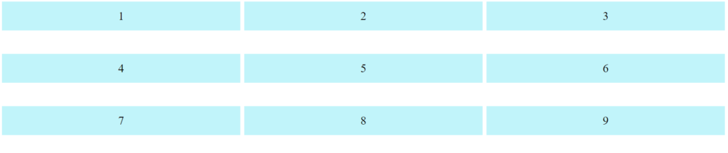
.grid-container {
  display: grid;
  column-gap: 60px;
}Output:
The row-gap property sets the gap between the rows:
Example:
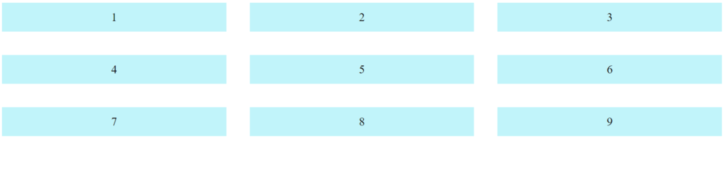
.grid-container {
  display: grid;
  row-gap: 60px;
}Output:
The gap property can also be used to set row-gap and column-gap in one value:
Example:
.grid-container{
  display: grid;
  gap: 50px;
}Output:
6.Grid Lines:
The lines between columns are called column lines.
The lines between rows are called row lines.
    A   B   C   D
  +---+---+---+---+
1 |   |   |   |   |
  +---+---+---+---+
2 |   |   |   |   |
  +---+---+---+---+
3 |   |   |   |   |
  +---+---+---+---+
4 |   |   |   |   |
+---+---+---+---+Example:
.grid-item {
background-color: #c1defc;
color: white;
padding: 30px;
text-align: center;
font-size: 10px;
}
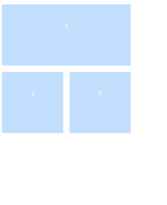
.item1 {
grid-column-start: 1;
grid-column-end: 3;
}<div class="grid-container">
<div class="grid-item item1">1</div>
<div class="grid-item item2">2</div>
<div class="grid-item item3">3</div>
</div>Output: