About Lesson
How to create Dropdowns using CSS?
CSS dropdowns are a type of user interface element that allows users to select an option from a list of choices that appears when they interact with a trigger element. Dropdowns are commonly used in navigation menus, form select elements, or any scenario where a user needs to choose from multiple options.
Let’s Create a Dropdown Step By Step:
Write HTML Code:
HTML
<!DOCTYPE html>
<html lang="en">
<head>
    <meta charset="UTF-8">
    <meta name="viewport" content="width=device-width, initial-scale=1.0">
    <link rel="stylesheet" href="styles.css">
    <title>CSS Dropdown Example</title>
    <link rel="stylesheet" href="style.css"/>
</head>
<body>
    <div class="dropdown">
        <button class="dropbtn">Menu</button>
        <div class="dropdown-content">
            <a href="#">Option 1</a>
            <a href="#">Option 2</a>
            <a href="#">Option 3</a>
        </div>
    </div>
</body>
</html>
Write CSS Code:
1. Basic styles for the dropdown:
CSS
.dropdown {
    position: relative;
    display: inline-block;
}
position: relative;: Positions the dropdown relative to its normal position in the document flow. This is necessary for absolute positioning of the dropdown content.display: inline-block;: Makes the dropdown behave like an inline element while allowing its dimensions to be set (in contrast to inline elements, which do not respect height and width properties).
2. Style for the dropdown button:
CSS
.dropbtn {
    background-color: #3498db;
    color: #fff;
    padding: 10px;
    border: none;
    cursor: pointer;
}
background-color: #3498db;: Sets the background color of the dropdown button to a shade of blue (#3498db).color: #fff;: Sets the text color of the dropdown button to white.padding: 10px;: Adds 10 pixels of padding to the top and bottom, and left and right of the dropdown button.border: none;: Removes any border from the dropdown button.cursor: pointer;: Changes the cursor to a pointer when hovering over the dropdown button, indicating it is clickable.
3. Style for the dropdown content:
CSS
.dropdown-content {
    display: none;
    position: absolute;
    background-color: #f9f9f9;
    min-width: 160px;
    box-shadow: 0 8px 16px rgba(0, 0, 0, 0.2);
    z-index: 1;
}
display: none;: Initially hides the dropdown content.position: absolute;: Positions the dropdown content absolutely with respect to the nearest positioned ancestor.background-color: #f9f9f9;: Sets the background color of the dropdown content to a light gray (#f9f9f9).min-width: 160px;: Sets the minimum width of the dropdown content to 160 pixels.box-shadow: 0 8px 16px rgba(0, 0, 0, 0.2);: Adds a shadow effect to the dropdown content.z-index: 1;: Sets the stacking order of the dropdown content to ensure it appears above other elements.
4. Style for dropdown content links:
CSS
.dropdown-content a {
    color: #333;
    padding: 12px 16px;
    text-decoration: none;
    display: block;
}
color: #333;: Sets the text color of the dropdown content links to a dark gray (#333).padding: 12px 16px;: Adds 12 pixels of padding to the top and bottom, and 16 pixels of padding to the left and right of each link.text-decoration: none;: Removes the underline decoration from the dropdown content links.display: block;: Makes the dropdown content links behave like block-level elements, causing them to stack vertically.
5. Change color on hover for dropdown content links:
CSS
.dropdown-content a:hover {
    background-color: #ddd;
}
background-color: #ddd;: Changes the background color of the dropdown content links to a lighter gray (#ddd) when hovered over.
6. Show dropdown content on hover:
CSS
.dropdown:hover .dropdown-content {
    display: block;
}- This rule ensures that when you hover over the dropdown container, the dropdown content becomes visible by changing its display property to block.
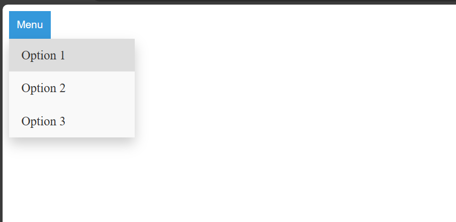
Output: