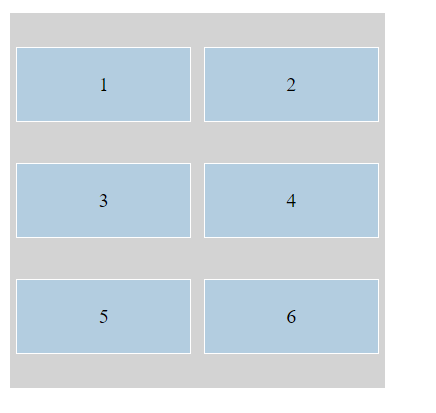
CSS Grid Container:
A grid container is an element with display: 'grid‘ or display: 'inline-grid', used to define a grid-based layout for its child elements.
Example:
  .grid-container {
            display: grid;
            grid-template-columns: repeat(3, 1fr);
            grid-gap: 10px;
            padding: 10px;
            background-color: rgb(166, 216, 199);
        }

        .grid-item {
            background-color: #b3cde0;
            border: 1px solid #fff;
            padding: 20px;
            text-align: center;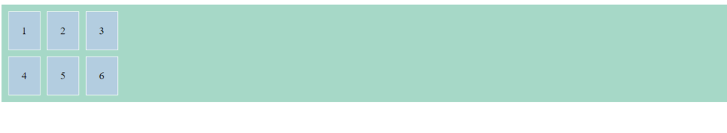
}div class="grid-container">
<div class="grid-item">1</div>
<div class="grid-item">2</div>
<div class="grid-item">3</div>
<div class="grid-item">4</div>
<div class="grid-item">5</div>
<div class="grid-item">6</div>
</div>
Output:
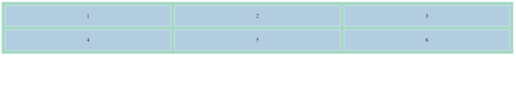
The grid template-Column Property:
The 'grid-template-columns‘ property in CSS is used to define the number, size, and layout of columns in a grid container. It allows you to specify the width of each column, as well as how many columns the grid should have.
Example:
.grid-container {
            display: grid;
            grid-template-columns: auto auto auto auto;
            grid-gap: 10px;
            padding: 10px;
            background-color: rgb(166, 216, 199);
        }

        .grid-item {
            background-color: #b3cde0;
            border: 1px solid #fff;
            padding: 20px;
            text-align: center;
}<div class="grid-container">
<div class="grid-item">1</div>
<div class="grid-item">2</div>
<div class="grid-item">3</div>
<div class="grid-item">4</div>
<div class="grid-item">5</div>
<div class="grid-item">6</div>
<div class="grid-item">7</div>
<div class="grid-item">8</div>
</div>Output:
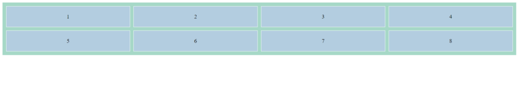
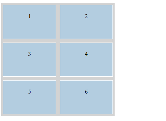
The Grid Template-Row Property:
The 'grid-template-rows' property in CSS is used to define the number, size, and layout of rows in a grid container. It allows you to specify the height of each row, as well as how many rows the grid should have.
Example:
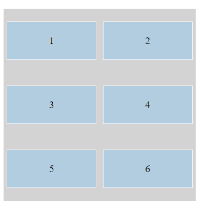
.grid-container {
            display: grid;
            grid-template-columns: auto auto auto;
            grid-template-rows: 80px 150px;
}<div class="grid-container">
<div class="grid-item">1</div>
<div class="grid-item">2</div>
<div class="grid-item">3</div>
<div class="grid-item">4</div>
<div class="grid-item">5</div>
<div class="grid-item">6</div>
</div>Output:
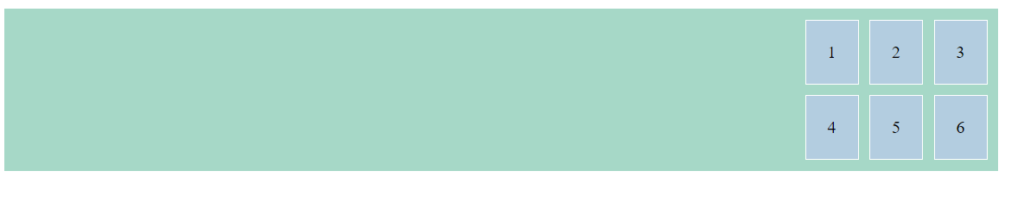
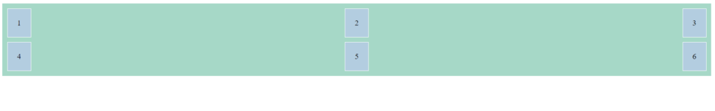
The Justify-content Property:
The 'justify-content' property in CSS is used to align the items inside a flex or grid container along the main axis, which is typically horizontal. It defines how the browser should distribute the space between and around content items along the main axis.
1.'flex-start' / 'start': Items are packed toward the start of the main axis.
Example:
.container {
    justify-content: flex-start;
}Output:
2. 'flex-end' /'end': Items are packed toward the end of the main axis.
Example:
.container {
    justify-content: flex-end;
}Output:
3. 'center': Items are centered along the main axis.
Example:
.container {
    justify-content: center;
}Output:

4. 'space-between': Items are evenly distributed with the first item at the start and the last item at the end.
Example:
.container {
    justify-content: space-between;
}
Output:
5. 'space-around': Items are evenly distributed with equal space around them.
Example:
.container {
    justify-content: space-around;
}
Output:

6. 'space-evenly': Items are distributed so that the spacing between any two items (and the space to the edges) is equal.
Example:
.container {
    justify-content: space-evenly;
}
Output:

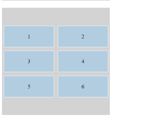
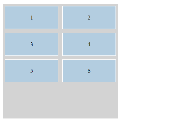
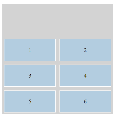
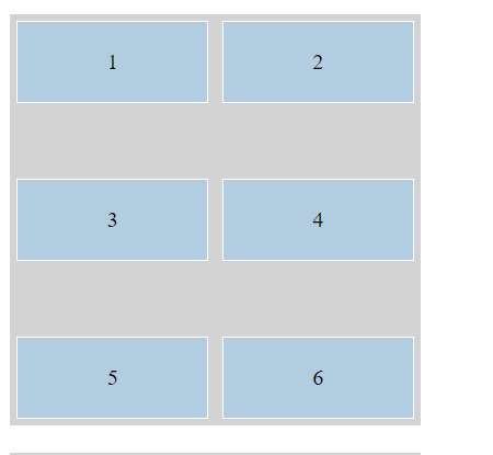
The Align-Content Property:
The align-content property in CSS is used to control the alignment of rows within a flex or grid container along the cross axis when there is extra space in the container. This property is most useful when the container has extra space in the vertical direction (for a horizontally-aligned flex container) or horizontal direction (for a vertically-aligned flex container).
Example:
.align-stretch {
    align-content: stretch;
}

.align-center {
    align-content: center;
}

.align-flex-start {
    align-content: flex-start;
}

.align-flex-end {
    align-content: flex-end;
}

.align-space-between {
    align-content: space-between;
}

.align-space-around {
    align-content: space-around;
}

.align-space-evenly {
    align-content: space-evenly;
}
Output:
Stretch:
Center:
Flex-Start:
Flex-end:
Space-between:
Space-around:
Space-evenly: