About Lesson
How to create Cards using CSS?
Cards are versatile components that can be used for displaying various types of content, such as articles, products, or user profiles.
Let’s Create a Card Step By Step:
Write HTML Code:
HTML
<!DOCTYPE html>
<html lang="en">
<head>
<meta charset="UTF-8">
<meta name="viewport" content="width=device-width, initial-scale=1.0">
<title>CSS Cards</title>
<link rel="stylesheet" href="style.css">
</head>
<body>
<div class="card">
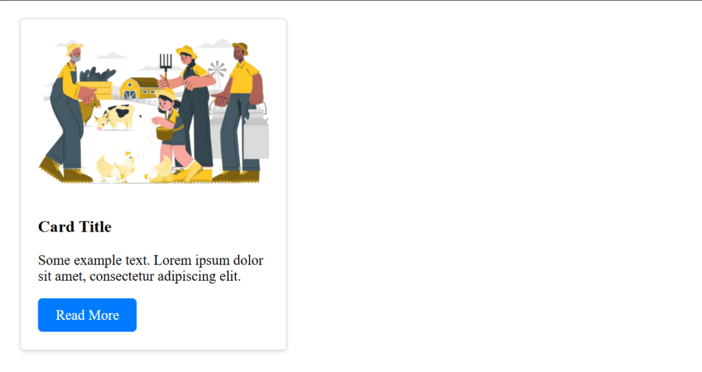
<img src="_cattleinsurance.png" alt="Image" class="card-img">
<div class="card-content">
<h3 class="card-title">Card Title</h3>
<p class="card-text">Some example text. Lorem ipsum dolor sit amet, consectetur adipiscing elit.</p>
<a href="#" class="card-btn">Read More</a>
</div>
</div>
</body>
</html>Write CSS Code:
1. Card Container Style:
CSS
.card {
  border: 1px solid #ccc;
  border-radius: 5px;
  box-shadow: 0 2px 4px rgba(0, 0, 0, 0.1);
  width: 300px;
  margin: 20px;
  overflow: hidden;
}
border: Adds a 1px solid border around the card with a light gray color (#ccc).border-radius: Rounds the corners of the card with a 5px radius to give it a softer appearance.box-shadow: Adds a subtle shadow effect to the card to make it stand out slightly from the background.width: Sets the width of the card to 300 pixels.margin: Adds a margin of 20 pixels around the card to provide spacing between multiple cards.overflow: Hides any content that may overflow the card’s boundaries.
2. Card Image Styles:
CSS
.card-img {
  width: 100%;
  height: auto;
}
width: 100%: Ensures that the image spans the full width of the card container.height: auto: Automatically adjusts the height of the image while maintaining its aspect ratio, preventing distortion.
3. Card Content Styles:
CSS
.card-content {
  padding: 20px;
}padding: Adds internal spacing within the card content area to prevent text from touching the edges.
4. Card Title Styles:
CSS
.card-title {
  margin-top: 0;
}
margin-top: 0: Removes any default top margin to ensure the title is snug against the top padding of the card content.
5. Card Buttons Styles:
CSS
.card-btn {
  display: inline-block;
  padding: 10px 20px;
  background-color: #007bff;
  color: #fff;
  text-decoration: none;
  border-radius: 5px;
}display:inline-block: Allows the button to be inline with the text but still have padding applied.padding: Adds internal spacing within the button for better clickability and aesthetics.background-color: Sets the background color of the button to a shade of blue (#007bff).color: Sets the text color of the button to white for better contrast against the background.text-decoration: Removes the default underline styling from anchor elements.border-radius: Rounds the corners of the button to match the card’s border-radius, creating a cohesive design.
6. Button Hover Effect:
CSS
.card-btn:hover {
  background-color: #0056b3;
}:hover: Applies styles when the mouse hovers over the button.background-color: Changes the background color of the button to a darker shade of blue (#0056b3) on hover, providing visual feedback to the user.
Output: