About Lesson
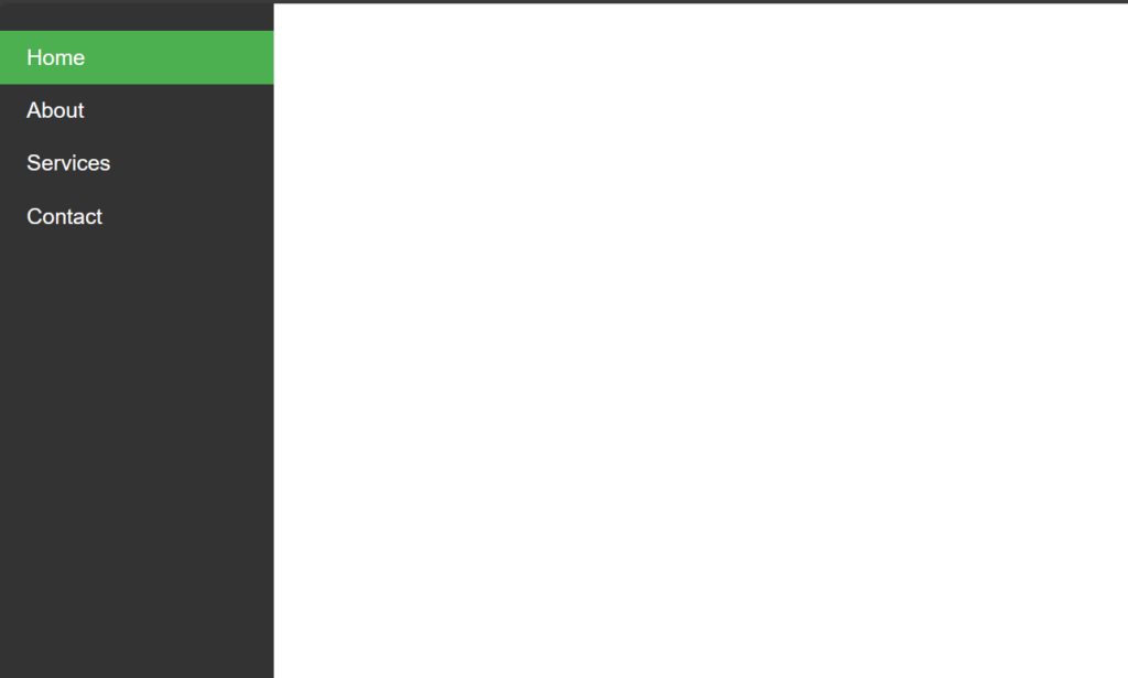
How to create Vertical Navbar using CSS?
Cards are versatile components that can be used for displaying various types of content, such as articles, products, or user profiles.
Let’s Create a Card Step By Step:
Write HTML Code:
HTML
<!DOCTYPE html>
<html lang="en">
<head>
    <meta charset="UTF-8">
    <meta name="viewport" content="width=device-width, initial-scale=1.0">
    <title>Vertical Navbar</title>
    <link rel="stylesheet" href="style.css">
</head>
<body>
    <div class="navbar">
        <a href="#" class="active">Home</a>
        <a href="#">About</a>
        <a href="#">Services</a>
        <a href="#">Contact</a>
    </div>
</body>
</html>
Write CSS Code:
1. Setting Global Styles:
CSS
body {
    margin: 0;
    font-family: Arial, sans-serif;
}
margin: 0;: Resets the default margin of the<body>element to 0, removing any default spacing.font-family: Arial, sans-serif;: Sets the default font family for the entire document to Arial, falling back to a generic sans-serif font if Arial is not available.
2. Styling the Navbar Container:
CSS
.navbar {
    height: 100%;
    width: 200px;
    background-color: #333;
    position: fixed;
    left: 0;
    top: 0;
    overflow-x: hidden;
    padding-top: 20px;
}
height: 100%;: Sets the height of the navbar to 100% of the viewport height, making it span the entire height of the browser window.width: 200px;: Sets the width of the navbar to 200 pixels.background-color: #333;: Sets the background color of the navbar to a dark gray color (#333).position: fixed;: Fixes the position of the navbar, so it remains in place even when the user scrolls the page.left: 0;: Positions the navbar flush against the left edge of the viewport.top: 0;: Positions the navbar flush against the top edge of the viewport.overflow-x: hidden;: Hides any content that overflows horizontally, preventing a horizontal scrollbar from appearing.padding-top: 20px;: Adds 20 pixels of padding to the top of the navbar, creating space between the content and the top edge of the navbar.
3. Styling Navbar Links:
CSS
.navbar a {
    display: block;
    color: white;
    padding: 10px 20px;
    text-decoration: none;
}display: block;: Makes the links appear as blocks, causing them to take up the full width of their container and allowing for padding and margins to be applied.color: white;: Sets the text color of the links to white.padding: 10px 20px;: Adds 10 pixels of padding to the top and bottom, and 20 pixels of padding to the left and right of each link.text-decoration: none;: Removes the underline decoration from the links.
4. Styling Navbar Links on Hover:
CSS
.navbar a:hover {
    background-color: #555;
}
background-color: #555;: Changes the background color of the links to a darker shade of gray (#555) when hovered over.
5. Styling Active Navbar Links:
CSS
.navbar a.active {
    background-color: #4CAF50;
}
background-color: #4CAF50;: Sets the background color of the active link to a green color (#4CAF50). This would typically be used to indicate the currently selected or active page in the navbar.
Output: