About Lesson
Defination:
The max-width property in CSS is used to set the maximum width of an element. It prevents the element from becoming wider than the specified value, even if the content inside the element could make it larger.
Syntax:
selector {
max-width: value;
}
Example:
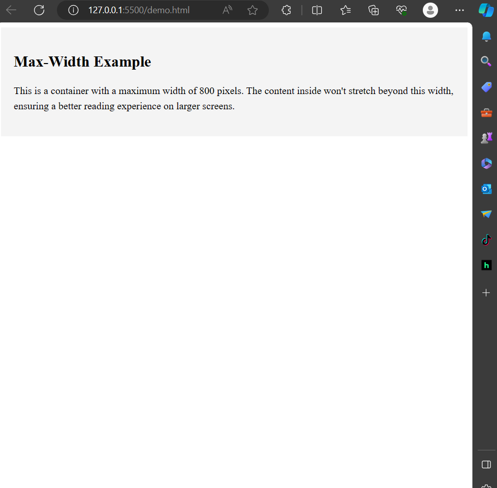
Let’s say you want to create a container with a maximum width to ensure that your content doesn’t stretch too wide on larger screens. Here’s an example:
<!DOCTYPE html><html lang=”en”><head><meta charset=”UTF-8″><meta name=”viewport” content=”width=device-width, initial-scale=1.0″><style>.container {max-width: 800px; /* Set the maximum width of the container to 800 pixels */margin: 0 auto; /* Center the container by setting left and right margins to ‘auto’ */padding: 20px; /* Add some padding for better visual appeal */background-color: #f4f4f4; /* Background color for better visibility */}p {line-height: 1.5; /* Set line height for better readability */}</style><title>CSS max-width Property Example</title></head><body><div class=”container”><h2>Max-Width Example</h2><p>This is a container with a maximum width of 800 pixels.The content inside won’t stretch beyond this width, ensuring a better reading experience on larger screens.</p></div></body></html>
Output:
In large Screen:
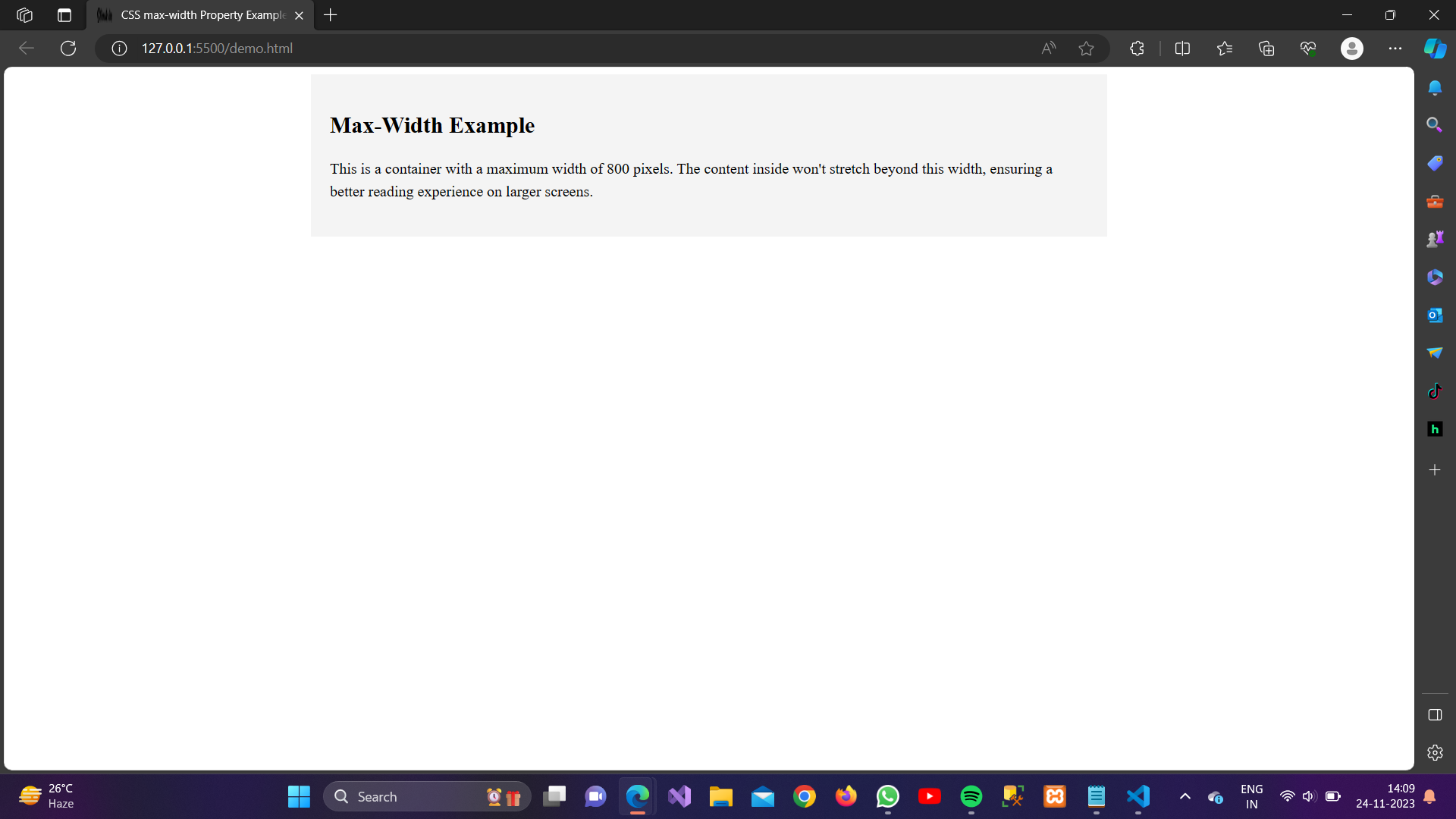
In Small Screen: