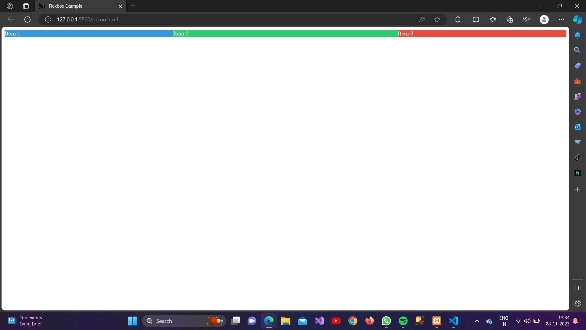
1.flex-grow: <number>;
The flex-grow property in CSS is used to specify the factor by which a flex item should grow relative to the other items in the flex container. It defines the ability of a flex item to grow and fill the available space along the main axis. The flex-grow property takes a number as its value, which represents the proportionate amount of space a flex item should take up compared to other items.
Example:
<!DOCTYPE html>
<html lang="en">
<head>
    <meta charset="UTF-8">
    <meta name="viewport" content="width=device-width, initial-scale=1.0">
    <link rel="stylesheet" href="styles.css">
    <title>Flexbox Example</title>
    <style>
        /* Apply flex container properties */
        .flex-container {
            display: flex;
        }
/* Style for flex items */
        .item {
            padding: 10px;
            margin: 5px;
            text-align: center;
        }
        .item1 {
            background-color: #3498db;
            color: #fff;
            flex-grow: 1;
            /* Item 1 can grow, but all items have the same base size */
        }
        .item2 {
            background-color: #2ecc71;
            color: #fff;
            flex-grow: 2;
            /* Item 2 can grow twice as much as Item 1 */
        }
        .item3 {
            background-color: #e74c3c;
            color: #fff;
            flex-grow: 1;
            /* Item 3 can grow, but not as much as Item 2 */
        }
    </style>
</head>
<body>
    <div class="flex-container">
        <div class="item item1">Item 1</div>
        <div class="item item2">Item 2</div>
        <div class="item item3">Item 3</div>
      </div>

    <br>
</body>
</html>
Output:
2.flex-shrink: <number>;
The flex-shrink property in CSS is used to specify the factor by which a flex item should shrink relative to the other items in the flex container when there is not enough space along the main axis. It defines the ability of a flex item to shrink to fit the available space.
Example:
<!DOCTYPE html>
<html lang="en">
<head>
    <meta charset="UTF-8">
    <meta name="viewport" content="width=device-width, initial-scale=1.0">
    <link rel="stylesheet" href="styles.css">
    <title>Flexbox Example</title>
    <style>
        /* Apply flex container properties */
        .flex-container {
            display: flex;
        }
      /* Style for flex items */
        .item {
            padding: 10px;
            margin: 5px;
            text-align: center;
        }
        .item1 {
            background-color: #3498db;
            color: #fff;
            flex-shrink: 1;
            /* Item 1 can grow, but all items have the same base size */
        }
       .item2 {
            background-color: #2ecc71;
            color: #fff;
            flex-shrink: 2;
            /* Item 2 can grow twice as much as Item 1 */
        }
        .item3 {
            background-color: #e74c3c;
            color: #fff;
            flex-shrink: 1;
            /* Item 3 can grow, but not as much as Item 2 */
        }
    </style>
</head>
<body>
    <div class="flex-container">
        <div class="item item1">Item 1</div>
        <div class="item item2">Item 2</div>
        <div class="item item3">Item 3</div>
      </div>

    <br>
</body>
</html>
Output:
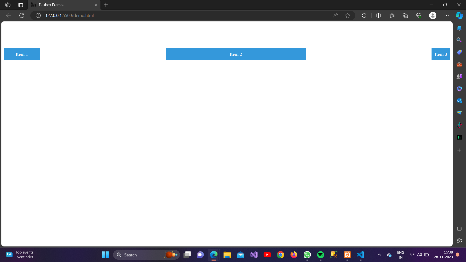
3.flex-basis: <length>|auto;
The flex-basis property in CSS is used to set the initial size of a flex item before the remaining space is distributed. It specifies the base size of the item along the main axis. The value can be a length (such as pixels or percentages) or auto.
- If set to a specific length, the item will have a fixed size.
- If set to auto, the item will use its content size as the basis.
Example:
<!DOCTYPE html>
<html lang="en">

<head>
    <meta charset="UTF-8">
    <meta name="viewport" content="width=device-width, initial-scale=1.0">
    <link rel="stylesheet" href="styles.css">
    <title>Flexbox Example</title>
    <style>
        /* Apply flex container properties */
        .flex-container {
            display: flex;
            justify-content: space-between;
            align-items: center;
            height: 200px;
        }

        /* Style for flex items */
        .item {
            background-color: #3498db;
            color: #fff;
            padding: 10px;
            text-align: center;
        }

        .item1 {
            flex-basis: 100px;
            /* Fixed size of 100 pixels */
        }

        .item2 {
            flex-basis: 30%;
            /* Basis size is 30% of the container's width */
        }

        .item3 {
            flex-basis: auto;
            /* Basis size is determined by the content */
        }
    </style>
</head>

<body>
    <div class="flex-container">
        <div class="item item1">Item 1</div>
        <div class="item item2">Item 2</div>
        <div class="item item3">Item 3</div>
    </div>

    <br>
    <br>

</body>

</html>
Output:
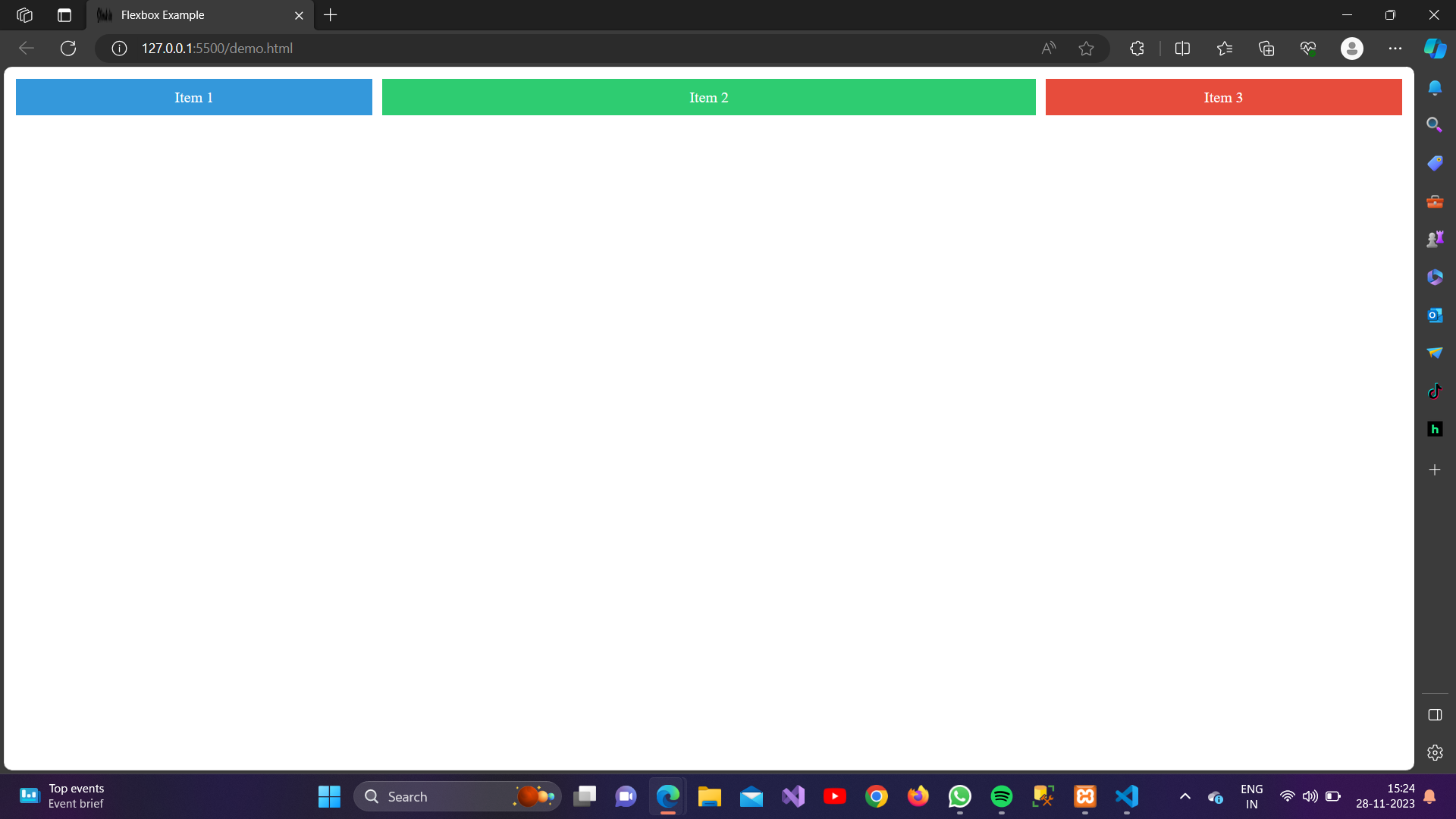
4.flex: none|<flex-grow> <flex-shrink> <flex-basis>;
The flex shorthand property in CSS is used to combine the three individual flex properties: flex-grow, flex-shrink, and flex-basis.
Example:
<!DOCTYPE html>
<html lang="en">

<head>
    <meta charset="UTF-8">
    <meta name="viewport" content="width=device-width, initial-scale=1.0">
    <link rel="stylesheet" href="styles.css">
    <title>Flexbox Example</title>
    <style>
        /* Apply flex container properties */
        .flex-container {
            display: flex;
        }

        /* Style for flex items */
        .item1 {
            background-color: #3498db;
            color: #fff;
            flex: 1 0 30%; /* Equivalent to flex-grow: 1; flex-shrink: 0; flex-basis: 30%; */
        }

        .item2 {
            background-color: #2ecc71;
            color: #fff;
            flex: 2 0 40%; /* Equivalent to flex-grow: 2; flex-shrink: 0; flex-basis: 40%; */
        }

        .item3 {
            background-color: #e74c3c;
            color: #fff;
            flex: 1 0 30%; /* Equivalent to flex-grow: 1; flex-shrink: 0; flex-basis: 30%; */
        }
    </style>
</head>

<body>
    <div class="flex-container">
        <div class="item item1">Item 1</div>
        <div class="item item2">Item 2</div>
        <div class="item item3">Item 3</div>
      </div>

    <br>
    <br>

</body>

</html>
Output:
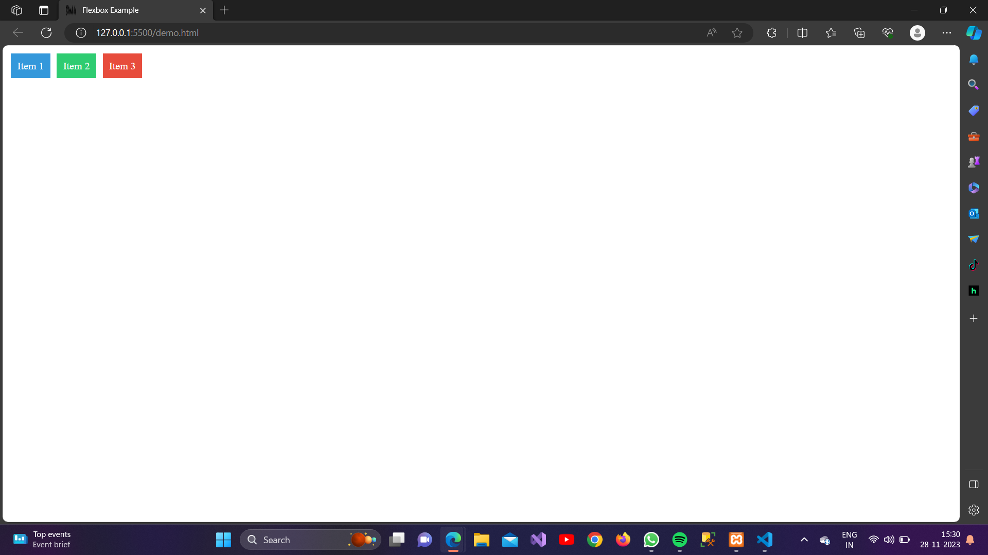
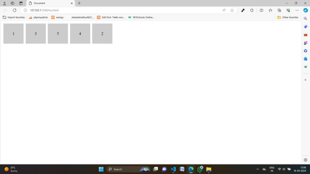
5.Order:
This property accepts a number value to determine the order of a flex item within its flex container. Lower values are placed before higher values. The default value is 0.
Example:
<!DOCTYPE html>
<html lang="en">

<head>
    <meta charset="UTF-8">
    <meta name="viewport" content="width=device-width, initial-scale=1.0">
    <title>Document</title>
</head>
<style>
    .container {
        display: flex;
    }

    .item {
        width: 100px;
        height: 100px;
        background-color: #ccc;
        margin: 5px;
        display: flex;
        justify-content: center;
        align-items: center;
        font-size: 20px;
    }
</style>

<body>
    <div class="container">
        <div class="item">1</div>
        <div class="item" style="order: 3;">2</div>
        <div class="item">3</div>
        <div class="item" style="order: 1;">4</div>
        <div class="item">5</div>
    </div>

</body>

</html>
Output:
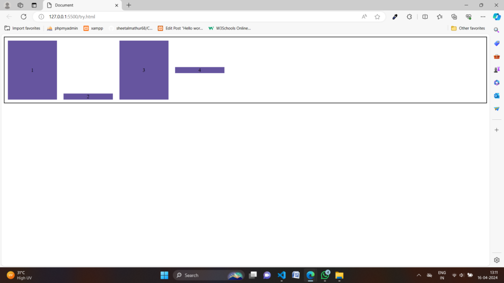
6.align-self:
This property accepts various values to determine how a specific flex item aligns itself along the cross-axis.
Example:
<!DOCTYPE html>
<html lang="en">

<head>
    <meta charset="UTF-8">
    <meta name="viewport" content="width=device-width, initial-scale=1.0">
    <title>Document</title>
</head>
<style>
    .container {
        display: flex;
        height: 200px;
        align-items: stretch;
        border: 2px solid #000;
    }

    .item {
        width: 150px;
        background-color: #66559f;
        margin: 10px;
        display: flex;
        justify-content: center;
        align-items: center;
    }
</style>

<body>
    <div class="container">
        <div class="item">1</div>
        <div class="item" style="align-self: flex-end;">2</div>
        <div class="item">3</div>
        <div class="item" style="align-self: center;">4</div>
    </div>

</body>

</html>
Output: