About Lesson
What is 2D Transforms?
CSS provides several 2D transform functions that allow you to modify the appearance and layout of elements in two-dimensional space. These transformations include translation, rotation, scaling, and skewing. Here are the main types of 2D transform functions:
1. Translate:
Moves an element horizontally and/or vertically from its original position.
Example:
HTML
<!DOCTYPE html>
<html lang="en">
<head>
<meta charset="UTF-8">
<meta name="viewport" content="width=device-width, initial-scale=1.0">
<title>2D Transforms</title>
</head>
<body>
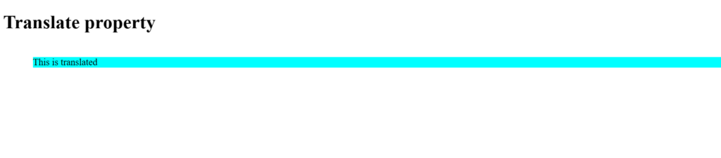
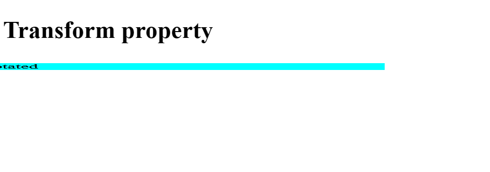
<div class="translate-example">This is translated</div>
</body>
</html>CSS
.translate-example {
  transform: translate(50px, 20px);
  background-color: aqua;
}
Output:
2. Rotate:
Rotates an element clockwise or counterclockwise around a specified point..
Example:
HTML
<!DOCTYPE html>
<html lang="en">
<head>
<meta charset="UTF-8">
<meta name="viewport" content="width=device-width, initial-scale=1.0">
<title>2D Transforms</title>
</head>
<body>
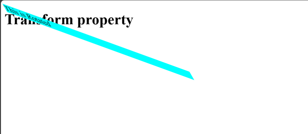
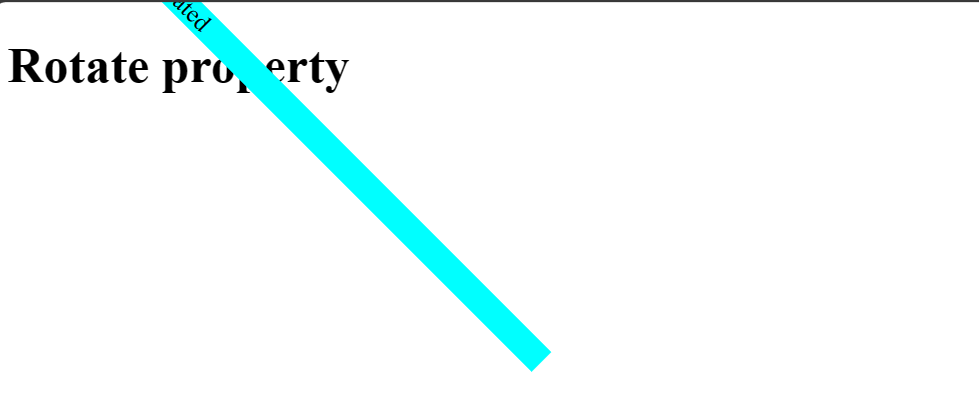
<div class="rotate-example">This is rotated</div>
</body>
</html>CSS
.rotate-example {
  transform: rotate(45deg);
  background-color: aqua;
  width:400px;
}
3. Scale:
Scales an element up or down in size along the horizontal and vertical axes.
Example:
HTML
<!DOCTYPE html>
<html lang="en">
<head>

    <meta charset="UTF-8">

    <meta name="viewport" content="width=device-width, initial-scale=1.0">
        <title>2D Transforms</title>
</head>

<body>
    <div class="scale-example">This is scaled</div>
</body>


</html>
CSS
.scale-example {
  transform: scale(1.5, 0.5);
}
4. Skew:
Skews an element by tilting it along the horizontal and/or vertical axes..
Example:
HTML
<!DOCTYPE html>
<html lang="en">
<head>

    <meta charset="UTF-8">

    <meta name="viewport" content="width=device-width, initial-scale=1.0">
        <title>2D Transforms</title>
</head>

<body>
    <div class="skew-example">This is skewed</div>
</body>


</html>
CSS
.skew-example {
  transform: skew(30deg, 20deg);
}