About Lesson
What are 3D Transforms?
In CSS, there are three main types of 3D transforms that allow you to manipulate elements in a three-dimensional space. These transforms are rotateX(), rotateY(), and rotateZ(). They enable you to rotate elements around their respective axes in three-dimensional space.
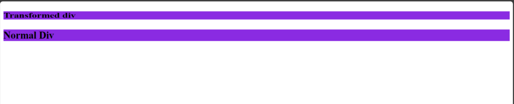
1. rotateX(angle):
This transform rotates an element around its horizontal axis, also known as the x-axis.
Syntax:
transform: rotateX(angle)Example:
HTML
<!DOCTYPE html>
<html lang="en">

<head>
    <meta charset="UTF-8">
    <meta name="viewport" content="width=device-width, initial-scale=1.0">
    <title>Simple 3D Transform Example</title>
    <link rel="stylesheet" href="style.css">
</head>

<body>

    <div class="element1">
        <h2>Transformed div</h2>
    </div>

    <div class="element2">
        <h2>Normal Div</h2>
    </div>
</body>

</body>

</html>
CSS
.element1 {
    transform: rotateX(45deg);
    background-color: blueviolet;
}
.element2 {
    background-color: blueviolet;
}
Output:
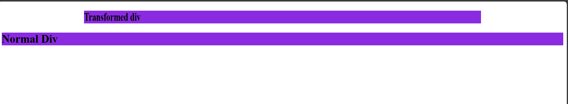
2. rotateY(angle):
This transform rotates an element around its vertical axis, also known as the y-axis.
Syntax:
transform: rotateY(angle)Example:
HTML
<!DOCTYPE html>
<html lang="en">

<head>
    <meta charset="UTF-8">
    <meta name="viewport" content="width=device-width, initial-scale=1.0">
    <title>Simple 3D Transform Example</title>
    <link rel="stylesheet" href="style.css">
</head>

<body>

    <div class="element1">
        <h2>Transformed div</h2>
    </div>

    <div class="element2">
        <h2>Normal Div</h2>
    </div>
</body>

</body>

</html>
CSS
.element1 {
    transform: rotateY(45deg);
    background-color: blueviolet;
}
.element2 {
    background-color: blueviolet;
}
Output:
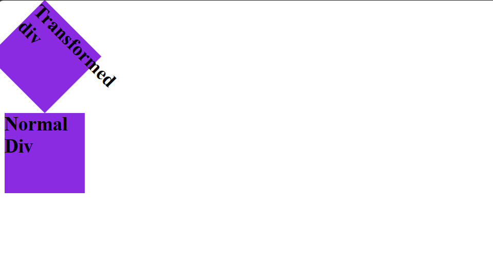
3. rotateZ(angle):
This transform rotates an element around its z-axis, which is perpendicular to the plane of the screen.
Syntax:
transform: rotatez(angle)Example:
HTML
<!DOCTYPE html>
<html lang="en">

<head>
    <meta charset="UTF-8">
    <meta name="viewport" content="width=device-width, initial-scale=1.0">
    <title>Simple 3D Transform Example</title>
    <link rel="stylesheet" href="style.css">
</head>

<body>

    <div class="element1">
        <h2>Transformed div</h2>
    </div>

    <div class="element2">
        <h2>Normal Div</h2>
    </div>
</body>

</body>

</html>
CSS
.element1 {
    transform: rotateZ(45deg);
    background-color: blueviolet;
    width: 100px;
    height: 100px;

}
.element2 {
    background-color: blueviolet;
    width: 100px;
    height: 100px;

}
Output:
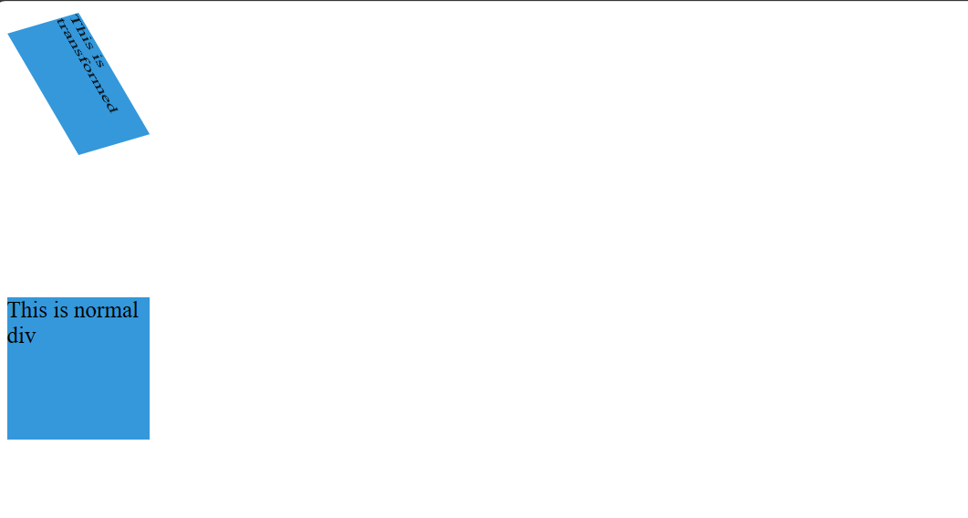
4. Apply all three rotations rotateZ(angle):
The CSS applies all three rotations (rotateX(), rotateY(), and rotateZ()) directly to the square element using the transform property, creating a combined 3D effect.
Syntax:
transform: rotateX(angle) rotateY(angle) rotateZ(angle);Example:
HTML
<!DOCTYPE html>
<html lang="en">

<head>
    <meta charset="UTF-8">
    <meta name="viewport" content="width=device-width, initial-scale=1.0">
    <title>Simple 3D Transform Example</title>
    <link rel="stylesheet" href="style.css">
</head>

<body>
    <div class="container">
        <div class="square1">This is transformed</div>
    </div>
    <div>
        <div class="square2">This is normal div</div>
    </div>
</body>

</html>
CSS
.container {
    width: 200px;
    height: 200px;
}
.square1 {
    width: 100px;
    height: 100px;
    background-color: #3498db;
    transform: rotateX(45deg) rotateY(45deg) rotateZ(45deg);
    /* Apply all three rotations */
}
.square2 {
    width: 100px;
    height: 100px;
    background-color: #3498db;
}
Output: