1. Static:
Definition:
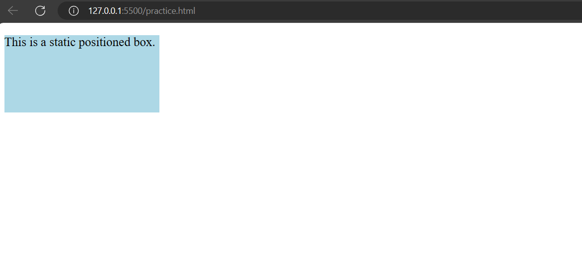
In CSS, the position: static property is the default position value for elements. When an element is set to position: static, it follows the normal flow of the document. In other words, it will be positioned according to the normal document flow, and properties like top, right, bottom, and left have no effect on it.
Example:
<!DOCTYPE html><html lang=”en”><head><meta charset=”UTF-8″><meta name=”viewport” content=”width=device-width, initial-scale=1.0″><title>Static Position Example</title><style>.box {background-color: lightblue;width: 200px;height: 100px;/* By default, the position is static *//* top, right, bottom, left properties have no effect *//* These are just for demonstration purposes */top: 50px;left: 50px;}</style></head><body><div class=”box”><p>This is a static positioned box.</p></div></body></html>
Output:
2. Relative Positioning:
Definition:
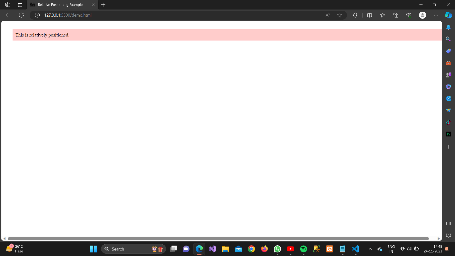
The element is positioned relative to its normal position.
Example:
<!DOCTYPE html><html lang=”en”><head><meta charset=”UTF-8″><meta name=”viewport” content=”width=device-width, initial-scale=1.0″><style>.relative-position {position: relative;top: 20px;left: 30px;background-color: #ffcccb;padding: 10px;}</style><title>Relative Positioning Example</title></head><body><div class=”relative-position”>This is relatively positioned.</div></body></html>
Output:
3. Absolute positioning:
Definition:
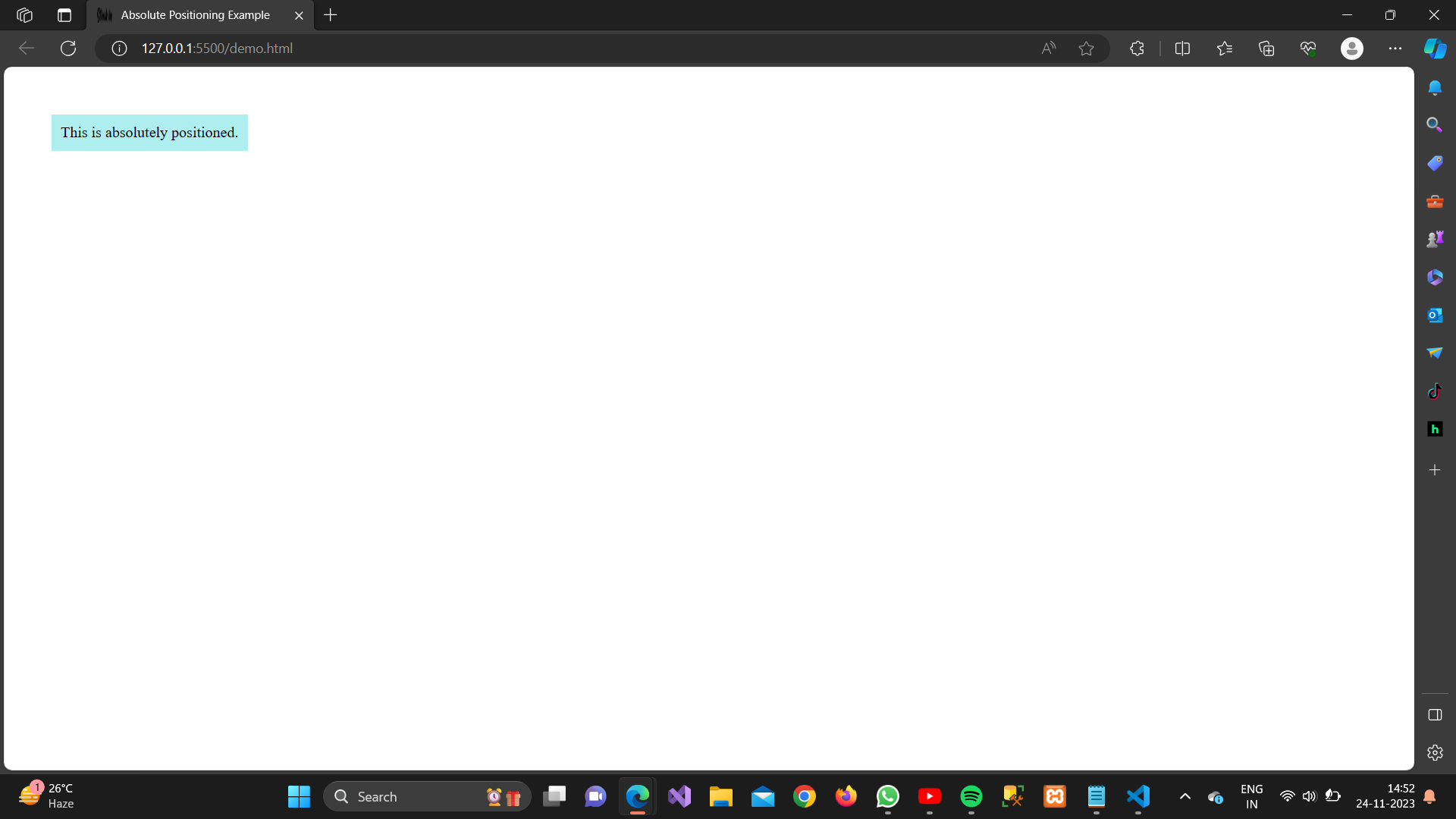
The element is positioned relative to its nearest positioned ancestor or the initial containing block.
Example:
<!DOCTYPE html>
<html lang=”en”><head>
<meta charset=”UTF-8″>
<meta name=”viewport” content=”width=device-width, initial-scale=1.0″>
<style>
.absolute-position {
position: absolute;
top: 50px;
left: 50px;
background-color: #aeeeee;
padding: 10px;
}
</style>
<title>Absolute Positioning Example</title>
</head><body>
<div class=”absolute-position”>
This is absolutely positioned.
</div>
</body></html>
Output:
4. Fixed Positioning:
Definition:
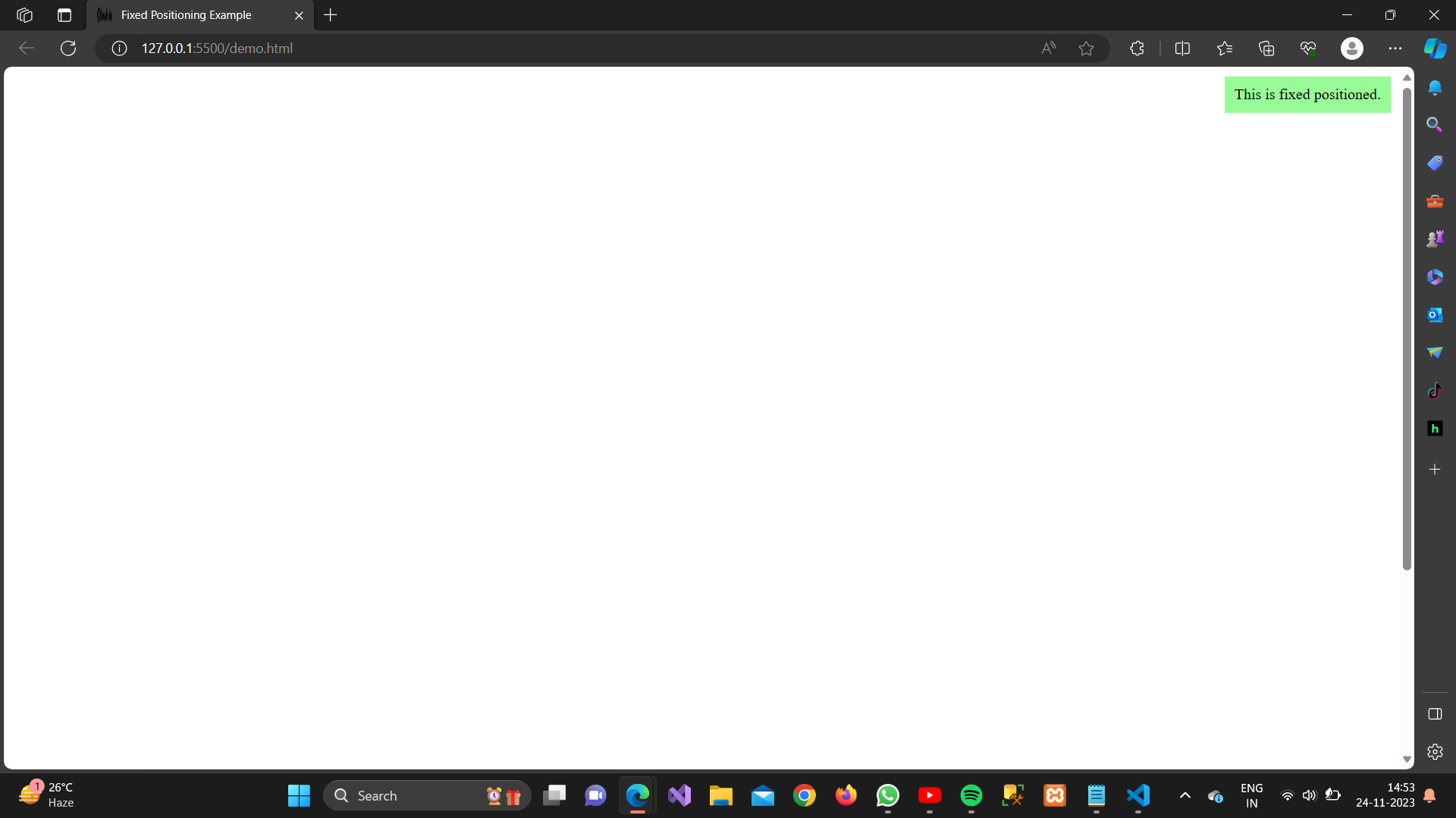
The element is positioned relative to the browser window.
Example:
<!DOCTYPE html>
<html lang=”en”><head>
<meta charset=”UTF-8″>
<meta name=”viewport” content=”width=device-width, initial-scale=1.0″>
<style>
.fixed-position {
position: fixed;
top: 10px;
right: 10px;
background-color: #98fb98;
padding: 10px;
}
</style>
<title>Fixed Positioning Example</title>
</head><body>
<div class=”fixed-position”>
This is fixed positioned.
</div>
<!– Some content to demonstrate scrolling –>
<div style=”height: 1000px;”></div>
</body></html>
Output:
4. Sticky Positioning:
Definition:
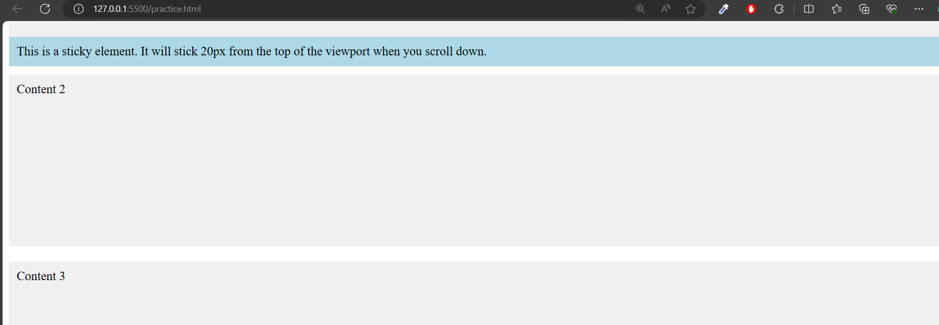
position: sticky is a CSS property that allows an element to remain positioned based on the user’s scroll position. When the specified element reaches a certain point on the screen (defined by top, right, bottom, or left properties), it becomes “stuck” to that position and remains there as the user continues to scroll.
Example:
<!DOCTYPE html><html lang=”en”><head><meta charset=”UTF-8″><meta name=”viewport” content=”width=device-width, initial-scale=1.0″><title>Sticky Example</title><style>.container {height: 1500px;/* Added height to demonstrate scrolling */position: relative;/* Necessary for positioning */}.sticky {position: -webkit-sticky;/* For Safari */position: sticky;top: 20px;/* Stick 20px from the top of the viewport */background-color: lightblue;padding: 10px;}/* Just for styling purposes */.content {height: 200px;background-color: #f0f0f0;margin-bottom: 20px;padding: 10px;}</style></head><body><div class=”container”><div class=”sticky”>This is a sticky element. It will stick 20px from the top of the viewport when you scroll down.</div><div class=”content”>Content 1</div><div class=”content”>Content 2</div><div class=”content”>Content 3</div></div></body></html>
Output:
