How to create Vertical Navbar using CSS?
Cards are versatile components that can be used for displaying various types of content, such as articles, products, or user profiles.
Let’s Create a Card Step By Step:
Write HTML Code:
HTML
<!DOCTYPE html>
<html lang="en">
<head>
    <meta charset="UTF-8">
    <meta name="viewport" content="width=device-width, initial-scale=1.0">
    <title>Vertical Navbar</title>
    <link rel="stylesheet" href="style.css">
</head>
<body>
    <div class="navbar">
        <a href="#" class="active">Home</a>
        <a href="#">About</a>
        <a href="#">Services</a>
        <a href="#">Contact</a>
    </div>
</body>
</html>
Write CSS Code:
1. Setting Global Styles:
CSS
body {
    margin: 0;
    font-family: Arial, sans-serif;
}
margin: 0;: Resets the default margin of the<body>element to 0, removing any default spacing.font-family: Arial, sans-serif;: Sets the default font family for the entire document to Arial, falling back to a generic sans-serif font if Arial is not available.
2. Styling the Navbar Container:
CSS
.navbar {
    height: 100%;
    width: 200px;
    background-color: #333;
    position: fixed;
    left: 0;
    top: 0;
    overflow-x: hidden;
    padding-top: 20px;
}
height: 100%;: Sets the height of the navbar to 100% of the viewport height, making it span the entire height of the browser window.width: 200px;: Sets the width of the navbar to 200 pixels.background-color: #333;: Sets the background color of the navbar to a dark gray color (#333).position: fixed;: Fixes the position of the navbar, so it remains in place even when the user scrolls the page.left: 0;: Positions the navbar flush against the left edge of the viewport.top: 0;: Positions the navbar flush against the top edge of the viewport.overflow-x: hidden;: Hides any content that overflows horizontally, preventing a horizontal scrollbar from appearing.padding-top: 20px;: Adds 20 pixels of padding to the top of the navbar, creating space between the content and the top edge of the navbar.
3. Styling Navbar Links:
CSS
.navbar a {
    display: block;
    color: white;
    padding: 10px 20px;
    text-decoration: none;
}display: block;: Makes the links appear as blocks, causing them to take up the full width of their container and allowing for padding and margins to be applied.color: white;: Sets the text color of the links to white.padding: 10px 20px;: Adds 10 pixels of padding to the top and bottom, and 20 pixels of padding to the left and right of each link.text-decoration: none;: Removes the underline decoration from the links.
4. Styling Navbar Links on Hover:
CSS
.navbar a:hover {
    background-color: #555;
}
background-color: #555;: Changes the background color of the links to a darker shade of gray (#555) when hovered over.
5. Styling Active Navbar Links:
CSS
.navbar a.active {
    background-color: #4CAF50;
}
background-color: #4CAF50;: Sets the background color of the active link to a green color (#4CAF50). This would typically be used to indicate the currently selected or active page in the navbar.
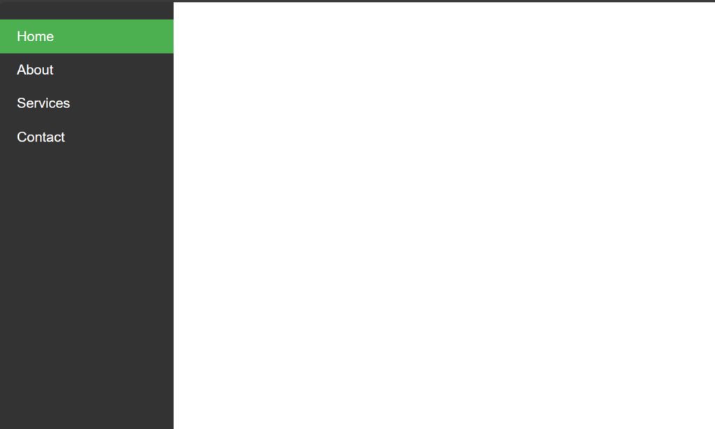
Output: