How to create Cards using CSS?
Cards are versatile components that can be used for displaying various types of content, such as articles, products, or user profiles.
Let’s Create a Card Step By Step:
Write HTML Code:
HTML
<!DOCTYPE html>
<html lang="en">

<head>
    <meta charset="UTF-8">
    <meta name="viewport" content="width=device-width, initial-scale=1.0">
    <title>CSS Cards</title>
    <link rel="stylesheet" href="style.css">
</head>

<body>
    <div class="card">
        <img src="_cattleinsurance.png" alt="Image" class="card-img">
        <div class="card-content">
            <h3 class="card-title">Card Title</h3>
            <p class="card-text">Some example text. Lorem ipsum dolor sit amet, consectetur adipiscing elit.</p>
            <a href="#" class="card-btn">Read More</a>
        </div>
    </div>

</body>

</html>
Write CSS Code:
1. Card Container Style:
CSS
.card {
  border: 1px solid #ccc;
  border-radius: 5px;
  box-shadow: 0 2px 4px rgba(0, 0, 0, 0.1);
  width: 300px;
  margin: 20px;
  overflow: hidden;
}
border: Adds a 1px solid border around the card with a light gray color (#ccc).border-radius: Rounds the corners of the card with a 5px radius to give it a softer appearance.box-shadow: Adds a subtle shadow effect to the card to make it stand out slightly from the background.width: Sets the width of the card to 300 pixels.margin: Adds a margin of 20 pixels around the card to provide spacing between multiple cards.overflow: Hides any content that may overflow the card’s boundaries.
2. Card Image Styles:
CSS
.card-img {
  width: 100%;
  height: auto;
}
width: 100%: Ensures that the image spans the full width of the card container.height: auto: Automatically adjusts the height of the image while maintaining its aspect ratio, preventing distortion.
3. Card Content Styles:
CSS
.card-content {
  padding: 20px;
}padding: Adds internal spacing within the card content area to prevent text from touching the edges.
4. Card Title Styles:
CSS
.card-title {
  margin-top: 0;
}
margin-top: 0: Removes any default top margin to ensure the title is snug against the top padding of the card content.
5. Card Buttons Styles:
CSS
.card-btn {
  display: inline-block;
  padding: 10px 20px;
  background-color: #007bff;
  color: #fff;
  text-decoration: none;
  border-radius: 5px;
}display:inline-block: Allows the button to be inline with the text but still have padding applied.padding: Adds internal spacing within the button for better clickability and aesthetics.background-color: Sets the background color of the button to a shade of blue (#007bff).color: Sets the text color of the button to white for better contrast against the background.text-decoration: Removes the default underline styling from anchor elements.border-radius: Rounds the corners of the button to match the card’s border-radius, creating a cohesive design.
6. Button Hover Effect:
CSS
.card-btn:hover {
  background-color: #0056b3;
}:hover: Applies styles when the mouse hovers over the button.background-color: Changes the background color of the button to a darker shade of blue (#0056b3) on hover, providing visual feedback to the user.
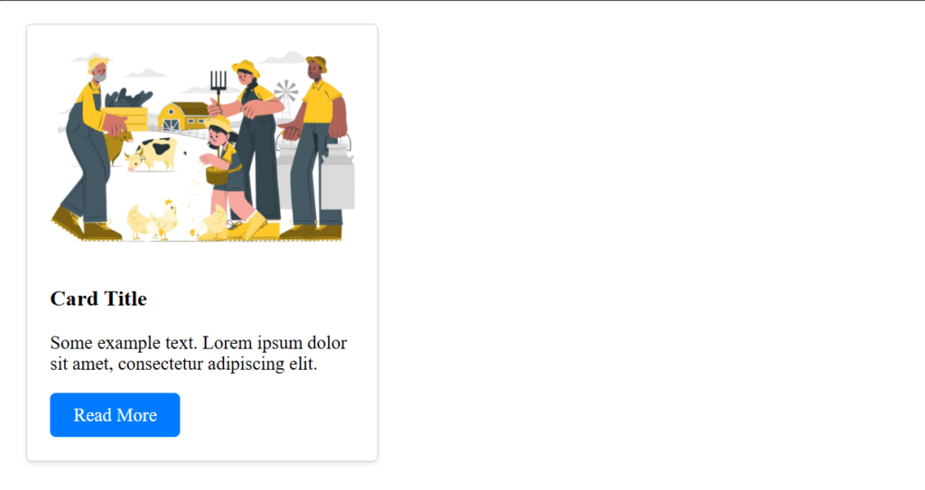
Output: