How to create Horizontal Navbar using CSS?
A horizontal navbar, also known as a horizontal navigation bar or simply a “nav bar”, is a common user interface element often found at the top of a webpage. It typically contains links or buttons that allow users to navigate to different sections or pages of a website.
Let’s Create a Card Step By Step:
Write HTML Code:
HTML
<!DOCTYPE html>
<html lang="en">
<head>
    <meta charset="UTF-8">
    <meta name="viewport" content="width=device-width, initial-scale=1.0">
    <title>Horizontal Navbar</title>
    <link rel="stylesheet" href="style.css">
</head>
<body>
    <div class="navbar">
        <a href="#" class="active">Home</a>
        <a href="#">About</a>
        <a href="#">Services</a>
        <a href="#">Contact</a>
    </div>
</body>
</html>
Write CSS Code:
1. Resetting Default Margin and Setting Font Family:
CSS
body {
    margin: 0;
    font-family: Arial, sans-serif;
}
margin: 0;: Resets the default margin of the<body>element to 0, removing any default spacing.font-family: Arial, sans-serif;: Sets the default font family for the entire document to Arial, falling back to a generic sans-serif font if Arial is not available.
2. Styling the Navbar Container::
CSS
.navbar {
    background-color: #333; /* Background color of the navbar */
    position: fixed; /* Fixed position */
    top: 0; /* Stick to the top */
    width: 100%; /* Full width of the viewport */
    overflow: hidden; /* Hide overflow */
}
background-color: #333;: Sets the background color of the navbar to a dark gray color (#333).position: fixed;: Fixes the position of the navbar, so it remains in place even when the user scrolls the page.top: 0;: Positions the navbar flush against the top edge of the viewport.width: 100%;: Sets the width of the navbar to 100% of the viewport width, making it span the entire width of the browser window.overflow: hidden;: Hides any content that overflows horizontally, ensuring that no horizontal scrollbar appears.
3. Styling Navbar Links:
CSS
.navbar a {
    float: left; /* Float links to the left to create a horizontal layout */
    display: block; /* Make the links appear as blocks */
    color: white; /* Text color */
    text-align: center; /* Center-align text */
    padding: 14px 16px; /* Padding for each link */
    text-decoration: none; /* Remove underline */
}
float: left;: Floats the links to the left to create a horizontal layout.display: block;: Makes the links appear as blocks, causing them to take up the full width of their container and allowing for padding and margins to be applied.color: white;: Sets the text color of the links to white.text-align: center;: Center-aligns the text within each link.padding: 14px 16px;: Adds 14 pixels of padding to the top and bottom, and 16 pixels of padding to the left and right of each link.text-decoration: none;: Removes the underline decoration from the links.
4. Styling Navbar Links on Hover:
CSS
.navbar a:hover {
    background-color: #555; /* Darker background color on hover */
}
background-color: #555;: Changes the background color of the links to a darker shade of gray (#555) when hovered over.
5. Styling Active Navbar Links:
CSS
.navbar a.active {
    background-color: #4CAF50;
}
background-color: #4CAF50;: Sets the background color of the active link to a green color (#4CAF50). This would typically be used to indicate the currently selected or active page in the navbar.
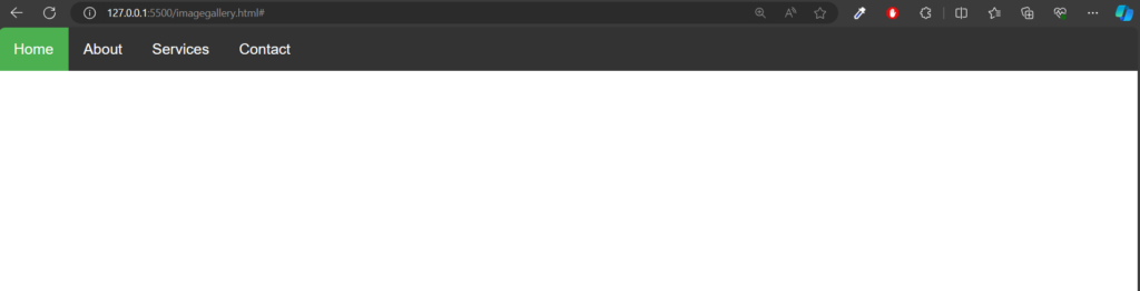
Output: