Masking in CSS:
CSS masking allows you to hide certain portions of an element, much like a stencil or cutout effect. You use a mask to specify which parts of the element should be visible and which should be hidden. It’s particularly useful when you want to apply complex shapes, transparency effects, or create engaging designs without modifying the content itself (like images or text).
Types of Masks in CSS:
- mask-image: This property allows you to apply an image (or gradient) as a mask over an element. Only the parts of the element that correspond to non-transparent parts of the mask will be visible.
- mask-size: Specifies the size of the mask image, similar to background-size.
- mask-repeat: Controls whether the mask image is repeated, like background-repeat.
- mask-position: Defines the position of the mask image.
How Masking Works:
In CSS, a mask is an image or gradient that works like a stencil. Parts of the element that are covered by non-transparent areas of the mask will be shown, while areas where the mask is transparent will hide the corresponding part of the element.
- Fully Opaque Area: The element is fully visible.
- Fully Transparent Area: The element is fully hidden.
- Semi-Transparent Area: The element is partially visible, depending on the transparency level.
Basic Syntax of Masking:
css code
.element {

  mask-image: url('path-to-mask-image.png');

  mask-size: cover;

}
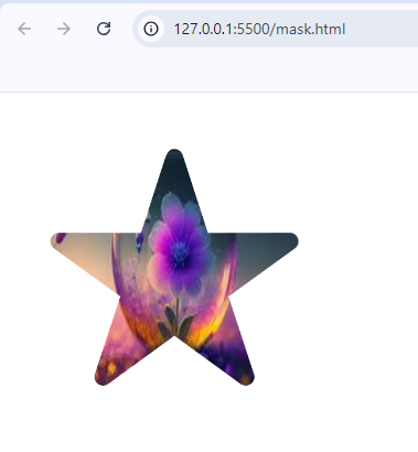
Example 1: Using an Image as a Mask
Let’s apply an image as a mask over a rectangular element:
<div class="masked-element">
        <img src="download (2).jpeg" alt="Masked Image">
</div>.masked-element img {
height: 300px;
width: 300px;
/* Mask properties */
-webkit-mask-image: url('star.png'); /* For Safari */
mask-image: url('star.png'); /* Standard */
mask-size: contain; /* Ensure the mask fits the image */
mask-position: center; /* Center the mask on the image */
mask-repeat: no-repeat; /* Do not repeat the mask */
}Output:

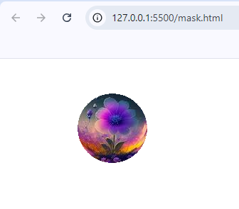
Example 2: Gradient as Mask with image
You can gradient masks with image to create complex masking effects:
<div class="masked-element">

    <img src="download (2).jpeg" alt="">

</div>.masked-element {
width: 100%;
height: 800px;
mask-size: 900px;
mask-repeat: no-repeat;
mask-position: -40px -40px;
/* Gradient as Mask */
mask-image: radial-gradient(circle at 190px 130px, white 5%, transparent 5%);
}
Output:

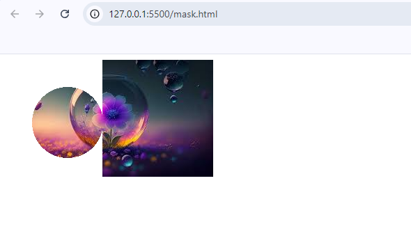
Example 3: Multiple Gradient as Mask with image
You can also use multiple gradient masks with image to create complex masking effects:
<div class="masked-element">

    <img src="download (2).jpeg" alt="">

</div>.masked-element {
width: 100%;
height: 800px;
mask-size: 900px;
mask-repeat: no-repeat;
mask-position: -40px -40px;
/* Multiple Gradient as Mask */
mask-image: radial-gradient(circle at 130px 130px, white 5%, transparent 5%), linear-gradient(to right, transparent 20%, white 10%);
}
Output:

