Button Groups:
Button groups in Bootstrap 5 provide a cohesive way to organize and display multiple buttons. Let’s dive into their use cases with examples!
1. Horizontal Button group:
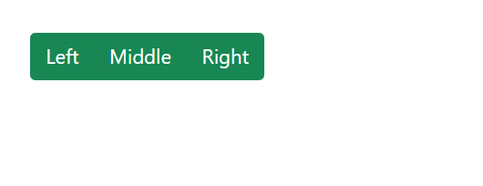
Buttons arranged horizontally are great for toolbars or navigation bars.
Example:
CSS
<div class="btn-group">
  <button type="button" class="btn btn-success">Left</button>
  <button type="button" class="btn btn-success">Middle</button>
  <button type="button" class="btn btn-success">Right</button>
</div>Output:

2. Vertical Button Groups:
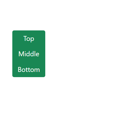
- Buttons are stacked vertically.
- Useful for side menus or grouped actions that need to be displayed in a vertical layout.
Example:
CSS
<div class="btn-group-vertical">
  <button type="button" class="btn btn-success">Top</button>
  <button type="button" class="btn btn-success">Middle</button>
  <button type="button" class="btn btn-success">Bottom</button>
</div>
Output:

3. Buttons Group Side by Side:
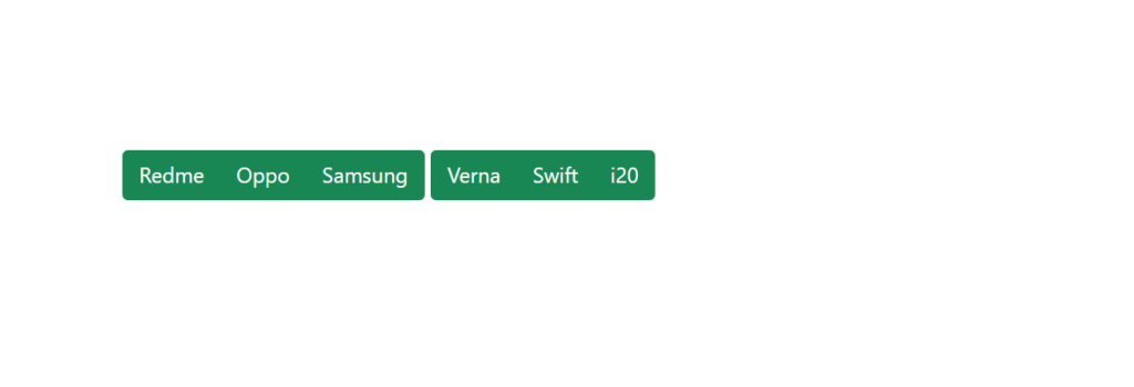
A button group with buttons aligned horizontally next to each other is known as side by side buttons .
Example:
CSS
<div class="btn-group">
      <button type="button" class="btn btn-success">Redme</button>
      <button type="button" class="btn btn-success">Oppo</button>
      <button type="button" class="btn btn-success">Samsung</button>
    </div>
    <div class="btn-group">
      <button type="button" class="btn btn-success">Verna</button>
      <button type="button" class="btn btn-success">Swift</button>
      <button type="button" class="btn btn-success">i20</button>
    </div>
Output:

4. Dropdown menu and nested buttons:
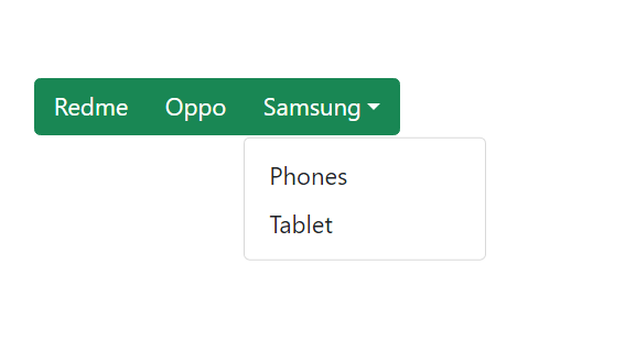
Combine dropdowns with buttons for advanced options.
Nested buttons are buttons that contain other buttons within them, often used to reveal additional options when clicked or hovered over.
A dropdown menu is a UI element that shows a list of options or actions when a button or control is clicked. It “drops down” from the button and typically hides when the user clicks outside of it or selects an option.
Example:
CSS
<div class="btn-group">
    <button type="button" class="btn btn-primary">Redme</button>
    <button type="button" class="btn btn-primary">Oppo</button>
    <div class="btn-group">
      <button type="button" class="btn btn-primary dropdown-toggle" data-bs-toggle="dropdown">Samsung</button>
      <div class="dropdown-menu">
        <a class="dropdown-item" href="# ">Phones</a>
        <a class="dropdown-item" href="# ">Tablet</a>
      </div>
    </div>
  </div>
Output:

When to Use Button Groups?
- Horizontal Groups: Toolbar actions or quick navigation.
- Vertical Groups: Menus or sequential actions.
- Dropdown Groups: For hierarchical or advanced options.
Key Features of Bootstrap Button Groups:
- Seamless integration into toolbars and side menus.
- Fully responsive for mobile and desktop views.
- Customizable using Bootstrap’s utility classes.
