Alerts in Bootstrap5:
Alerts in Bootstrap 5 are essential UI components that provide feedback messages for user actions or notifications. Let’s explore their types and functionalities in an engaging way!
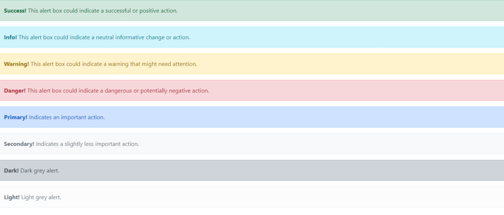
1. Alert Styles:
Bootstrap offers a variety of alert styles to match the context of your messages:
- Success Alerts for positive actions.
- Info Alerts for neutral informative actions.
- Warning Alerts to grab attention for potential issues.
- Danger Alerts for critical or negative actions.
You can also experiment with primary, secondary, light, and dark alerts to suit your design.
Example:
<div class="alert alert-success">
    <strong>Success!</strong> This alert box could indicate a successful or positive action.
  </div>
  <div class="alert alert-info">
    <strong>Info!</strong> This alert box could indicate a neutral informative change or action.
  </div>
  <div class="alert alert-warning">
    <strong>Warning!</strong> This alert box could indicate a warning that might need attention.
  </div>
  <div class="alert alert-danger">
    <strong>Danger!</strong> This alert box could indicate a dangerous or potentially negative action.
  </div>
  <div class="alert alert-primary">
    <strong>Primary!</strong> Indicates an important action.
  </div>
  <div class="alert alert-secondary">
    <strong>Secondary!</strong> Indicates a slightly less important action.
  </div>
  <div class="alert alert-dark">
    <strong>Dark!</strong> Dark grey alert.
  </div>
  <div class="alert alert-light">
    <strong>Light!</strong> Light grey alert.
  </div>
  </div>
Output:
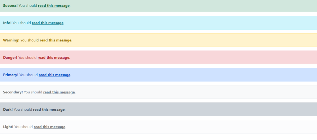
2. Alert Links:
Make your alerts interactive by adding links! Use the .alert-link class to style the links and ensure they seamlessly integrate into the alert box. For example, provide users with a relevant action or more details through a clickable link inside the alert.
Example:
<div class="alert alert-success">
    <strong>Success!</strong> You should <a href="#" class="alert-link">read this message</a>.
  </div>
  <div class="alert alert-info">
    <strong>Info!</strong> You should <a href="#" class="alert-link">read this message</a>.
  </div>
  <div class="alert alert-warning">
    <strong>Warning!</strong> You should <a href="#" class="alert-link">read this message</a>.
  </div>
  <div class="alert alert-danger">
    <strong>Danger!</strong> You should <a href="#" class="alert-link">read this message</a>.
  </div>
  <div class="alert alert-primary">
    <strong>Primary!</strong> You should <a href="#" class="alert-link">read this message</a>.
  </div>
  <div class="alert alert-secondary">
    <strong>Secondary!</strong> You should <a href="#" class="alert-link">read this message</a>.
  </div>
  <div class="alert alert-dark">
    <strong>Dark!</strong> You should <a href="#" class="alert-link">read this message</a>.
  </div>
  <div class="alert alert-light">
    <strong>Light!</strong> You should <a href="#" class="alert-link">read this message</a>.
  </div>
</div>
Output:
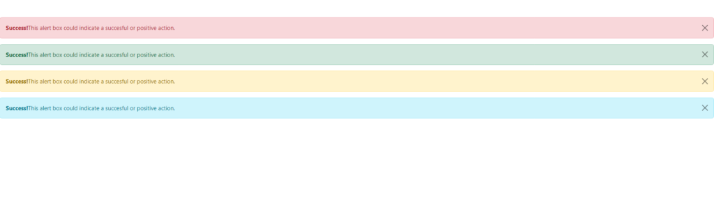
3. Dismissible Alerts:
Keep things clean with closable alerts. These allow users to dismiss alerts after reading them, using the btn-close class. It’s a great way to enhance user experience without overwhelming them with persistent notifications.
Example:
<div class="alert  alert-danger alert-dismissible fade show">
    <button type="button" class="btn-close" data-bs-dismiss="alert"></button>
    <strong>Success!</strong>This alert box could indicate a succesful or positive action.
  </div>
  <div class="alert  alert-success alert-dismissible">
    <button type="button" class="btn-close" data-bs-dismiss="alert"></button>
    <strong>Success!</strong>This alert box could indicate a succesful or positive action.
  </div>
  <div class="alert  alert-warning alert-dismissible">
    <button type="button" class="btn-close" data-bs-dismiss="alert"></button>
    <strong>Success!</strong>This alert box could indicate a succesful or positive action.
  </div>
  <div class="alert  alert-info alert-dismissible">
    <button type="button" class="btn-close" data-bs-dismiss="alert"></button>
    <strong>Success!</strong>This alert box could indicate a succesful or positive action.
  </div>
Output:
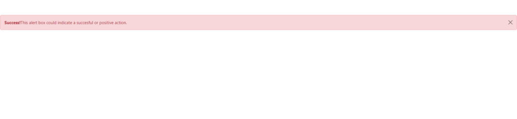
4. Animated Alerts:
Take user engagement up a notch with animated alerts! The smooth fade-in and fade-out animations grab attention effectively.
Example:
<div class="alert  alert-danger alert-dismissible fade show">
    <button type="button" class="btn-close" data-bs-dismiss="alert"></button>
    <strong>Success!</strong>This alert box could indicate a succesful or positive action.
  </div>
Output:
By combining these features, you can deliver a seamless and visually appealing notification system on your website!