1. Button Styles:
Bootstrap buttons come in various pre-defined styles:
- Primary, Success, Danger, Info, Warning, and more!
- Special Link Buttons provide a hyperlink look with button behavior.
Example:
    <button type="button" class="btn">Basic btn</button>
    <button type="button" class="btn btn-warning">Warning btn</button>
    <button type="button" class="btn btn-dark">Dark btn</button>
    <button type="button" class="btn btn-success">Success btn</button>
    <button type="button" class="btn btn-info">Info btn</button>
    <button type="button" class="btn btn-primary">Primary btn</button>
    <button type="button" class="btn btn-light">Light btn</button>
    <button type="button" class="btn btn-secondary">Secondary btn</button>
    <button type="button" class="btn btn-danger">Danger btn</button>
    <button type="button" class="btn btn-link">Link btn</button>
Output:

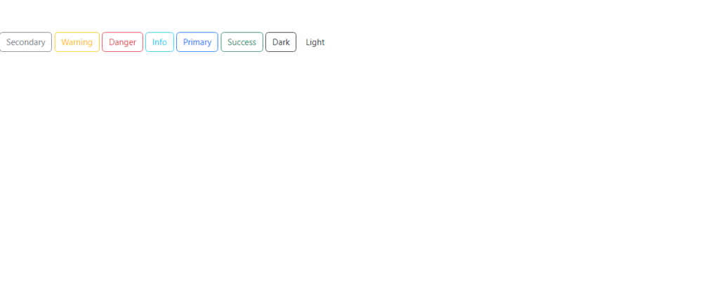
2. Button Outline:
For a sleek bordered design, use outline buttons. These maintain the button style while appearing minimal and elegant.
Example:
    <button type="button" class="btn btn-outline-secondary">Secondary</button>
    <button type="button" class="btn btn-outline-warning">Warning</button>
    <button type="button" class="btn btn-outline-danger">Danger</button>
    <button type="button" class="btn btn-outline-info">Info</button>
    <button type="button" class="btn btn-outline-primary">Primary</button>
    <button type="button" class="btn btn-outline-success">Success</button>
    <button type="button" class="btn btn-outline-dark">Dark</button>
    <button type="button" class="btn btn-outline-light text-dark">Light</button>
Output:

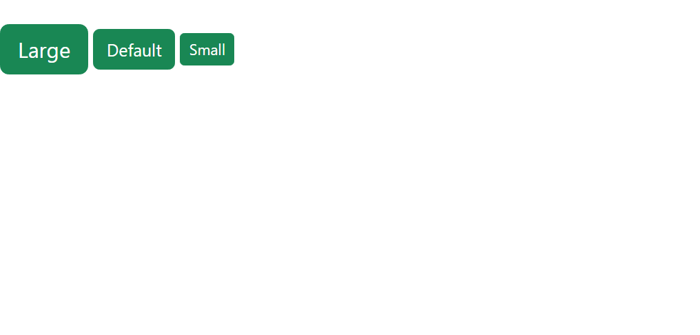
3. Button sizes:
Customize button size with:
.btn-lgfor large buttons..btn-smfor small buttons.- Default buttons without size classes are standard.
Example:
    <button type="button" class="btn btn-success btn-lg">Large</button>
    <button type="button" class="btn btn-success">Default</button>
    <button type="button" class="btn btn-success btn-sm">Small</button>
Output:

4. Block level buttons:
Expand buttons to the full width of their container using .btn-block. For multiple block buttons, control spacing with .gap-* classes.
Example 1:
<div class="d-grid">
    <button type="button" class="btn btn-success btn-block">Full-Width Button</button>
  </div>
Output:

Example 2:
<div class="d-grid gap-3">
    <button type="button" class="btn btn-success btn-block">Full-Width Button</button>
    <button type="button" class="btn btn-success btn-block">Full-Width Button</button>
    <button type="button" class="btn btn-success btn-block">Full-Width Button</button>
  </div>
Output:

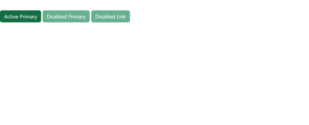
5. Active/Disabled Buttons:
Active buttons: indicate that the button is currently selected or engaged in some manner. They are typically used in navigation bars, tabbed interfaces, or to show the current state in a multi-step form.
Disabled buttons: indicate that the button is not currently interactive or available for use. This can be due to various reasons such as a form validation failure or a conditional requirement not being met.
Example:
<button type="button" class="btn btn-success active">Active Primary</button>
    <button type="button" class="btn btn-success" disabled>Disabled Primary</button>
    <a href="#" class="btn btn-success disabled">Disabled Link</a>
Output:

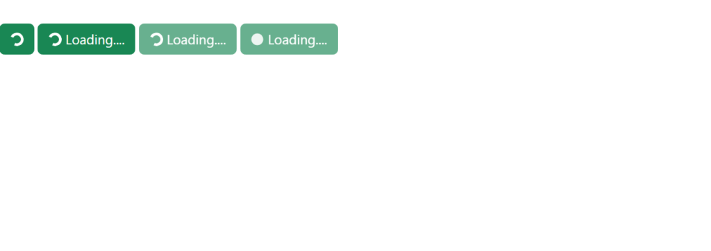
6. Spinner Buttons:
Add spinners to indicate loading states or processing tasks with:
.spinner-borderfor circular spinners..spinner-growfor growing spinners.
Example:
<button class="btn btn-success">
        <span class="spinner-border spinner-border-sm"></span>
    </button>
    <button class="btn btn-success">
        <span class="spinner-border spinner-border-sm"></span>
        Loading....
    </button>
    <button class="btn btn-success">
        <span class="spinner-border spinner-border-sm"></span>
        Loading....
    </button>
    <button class="btn btn-success">
        <span class="spinner-grow spinner-grow-sm"></span>
        Loading....
    </button>
Output:

