Progress Bar
A progress bar is a visual indicator that shows how much of a task has been completed.
To create a default progress bar, add a .progress class to a container element and add the .progress-bar class to its child element. Use the CSS width property to set the width of the progress bar:
Example:
<!DOCTYPE html>
<html lang="en">
<head>
    <meta charset="UTF-8">
    <meta name="viewport" content="width=device-width, initial-scale=1.0">
    <title>Progress Bar</title>
    <link rel="stylesheet" href="https://cdn.jsdelivr.net/npm/bootstrap@5.3.0/dist/css/bootstrap.min.css">
</head>
<body>

<div class="container mt-5">
    <div class="progress">
        <div class="progress-bar" style="width: 70%;">70%</div>
    </div>
</div>

</body>
</html>
Output:

Progress Bar Height
The default height for a Bootstrap progress bar is 16px. You can change it by using CSS height property.
Example:
<div class="progress" style="height: 50px;">
    <div class="progress-bar bg-primary" style="width: 70%;">70%</div>
</div>
Output:

Progress Bar Labels
A progress bar label is the text inside the progress bar that shows the percentage of completion. This helps users understand how much progress has been made.
<div class="progress" style="height: 15px;">
    <div class="progress-bar bg-success" style="width: 65%;">65% Complete</div>
</div>
Output:

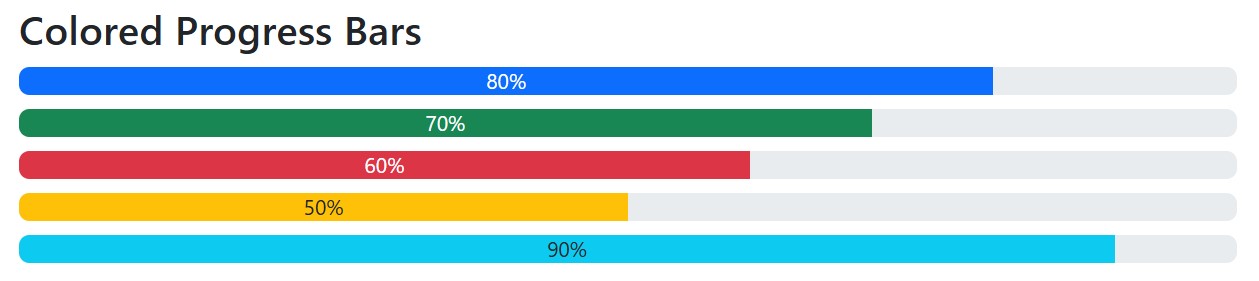
Colored Progress Bar
By default, the progress bar is blue (primary). Use any of the contextual background classes to change its color:
Example:
<!DOCTYPE html>
<html lang="en">
<head>
    <meta charset="UTF-8">
    <meta name="viewport" content="width=device-width, initial-scale=1.0">
    <title>Colored Progress Bars</title>
    <link rel="stylesheet" href="https://cdn.jsdelivr.net/npm/bootstrap@5.3.0/dist/css/bootstrap.min.css">
</head>
<body>

<div class="container mt-5">
    <h4>Colored Progress Bars</h4>

    <!-- Primary (Blue) -->
    <div class="progress mb-2">
        <div class="progress-bar bg-primary" style="width: 80%;">80%</div>
    </div>

    <!-- Success (Green) -->
    <div class="progress mb-2">
        <div class="progress-bar bg-success" style="width: 70%;">70%</div>
    </div>

    <!-- Danger (Red) -->
    <div class="progress mb-2">
        <div class="progress-bar bg-danger" style="width: 60%;">60%</div>
    </div>

    <!-- Warning (Yellow) -->
    <div class="progress mb-2">
        <div class="progress-bar bg-warning text-dark" style="width: 50%;">50%</div>
    </div>

    <!-- Info (Light Blue) -->
    <div class="progress mb-2">
        <div class="progress-bar bg-info text-dark" style="width: 90%;">90%</div>
    </div>

</div>

</body>
</html>
Output:
Striped Progress Bars
You can add the class “progress-bar-striped” to the “progress-bar” element within your HTML code
Example:
<!-- Striped Blue -->
    <div class="progress mb-2">
        <div class="progress-bar progress-bar-striped bg-primary" style="width: 75%;">75%</div>
    </div>

    <!-- Striped Green -->
    <div class="progress mb-2">
        <div class="progress-bar progress-bar-striped bg-success" style="width: 60%;">60%</div>
    </div>
Output:

Animated Progress Bar
Create a visual bar element in your design (like a webpage or presentation) and then apply CSS animation properties to dynamically change its width or appearance over time.
Example:
<!DOCTYPE html>
<html lang="en">
<head>
    <meta charset="UTF-8">
    <meta name="viewport" content="width=device-width, initial-scale=1.0">
    <title>Animated Progress Bar</title>
    <link rel="stylesheet" href="https://cdn.jsdelivr.net/npm/bootstrap@5.3.0/dist/css/bootstrap.min.css">
</head>
<body>

<div class="container mt-5">
    <h4>Animated Progress Bar</h4>

    <div class="progress">
        <div class="progress-bar progress-bar-striped progress-bar-animated bg-info" style="width: 80%;">
            80% Loading...
        </div>
    </div>

</div>

</body>
</html>
Output:

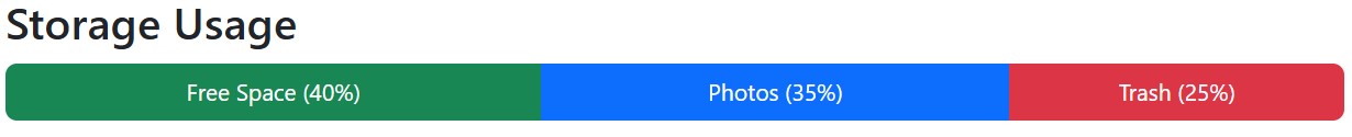
Multiple Progress Bar
A user interface where several progress bars are displayed simultaneously, each representing the progress of a separate, independent task or process happening within a single application or webpage.
Example:
<!DOCTYPE html>
<html lang="en">
<head>
    <meta charset="UTF-8">
    <meta name="viewport" content="width=device-width, initial-scale=1.0">
    <title>Storage Usage Progress Bar</title>
    <link rel="stylesheet" href="https://cdn.jsdelivr.net/npm/bootstrap@5.3.0/dist/css/bootstrap.min.css">
</head>
<body>

<div class="container mt-5">
    <h4>Storage Usage</h4>

    <div class="progress" style="height: 30px;">
        <!-- Free Space -->
        <div class="progress-bar bg-success" style="width: 40%;">Free Space (40%)</div>
        <!-- Photos -->
        <div class="progress-bar bg-primary" style="width: 35%;">Photos (35%)</div>
        <!-- Trash -->
        <div class="progress-bar bg-danger" style="width: 25%;">Trash (25%)</div>
    </div>

</div>

</body>
</html>
Output: